H👁,
m👁 name is pitscher.
👁 am an artist and des👁gner working with technology in d👁verse ways.
Here is m👁 contact — Let's create something n👁ce together!
typeface by Erik Sachse scroll to 👁 some
 print & web projects
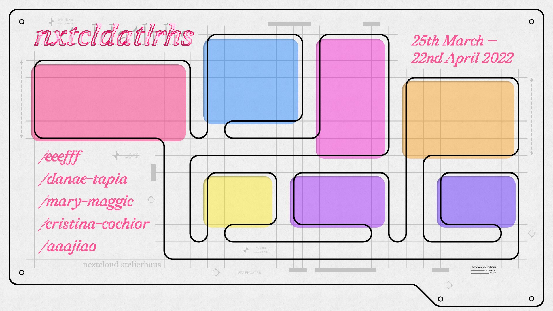
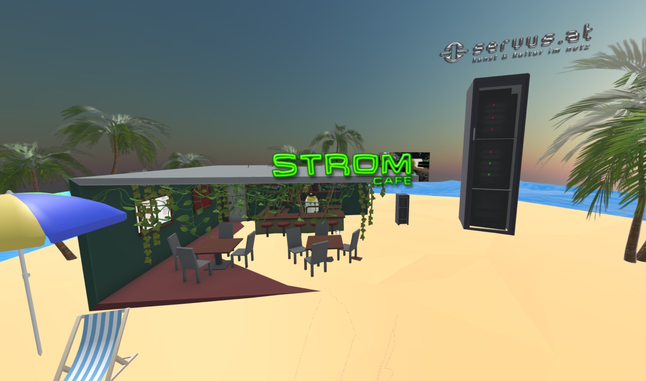
Next Cloud Atelierhaus
03 2022
Davide Bevilacqua, S()fia Braga and I organized an online residency through the net culture initiative servus.at. With Juan Pablo Linares Ceballos I worked on the visual identity that is reminiscent of an abstract floor plan.
We also created a custom website generator that takes the content from a Nextcloud folder and builds javascript application with Svelte.
visit the atelierhaus
Fonts in use: redaction
.jpg)
.jpg)
.jpg)
.jpg)
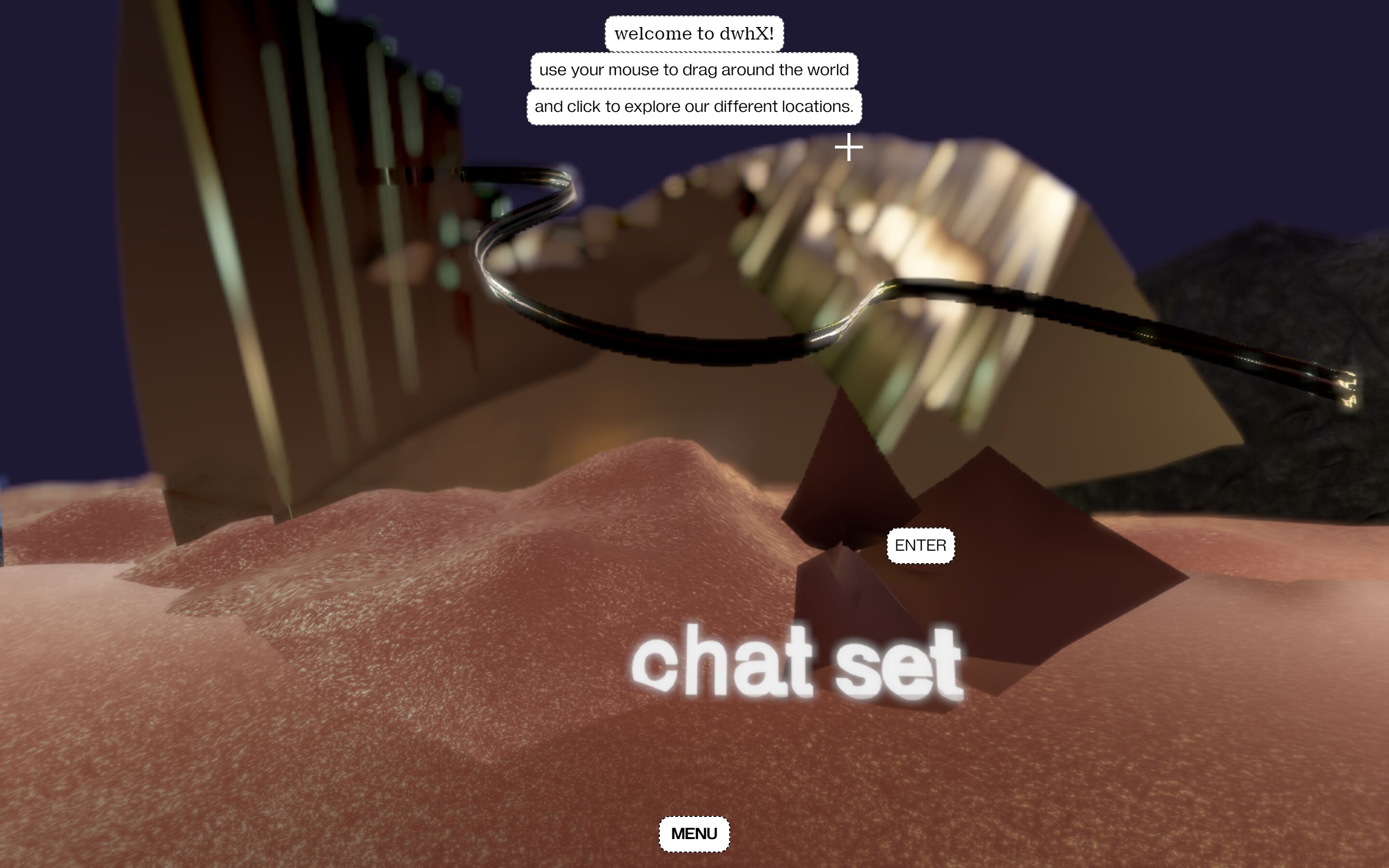
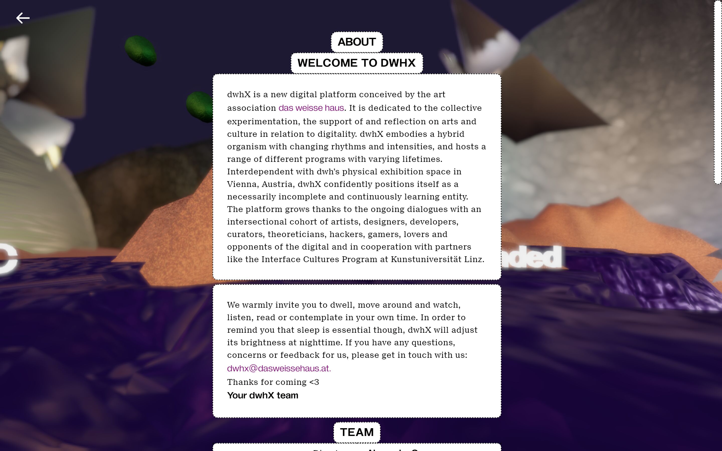
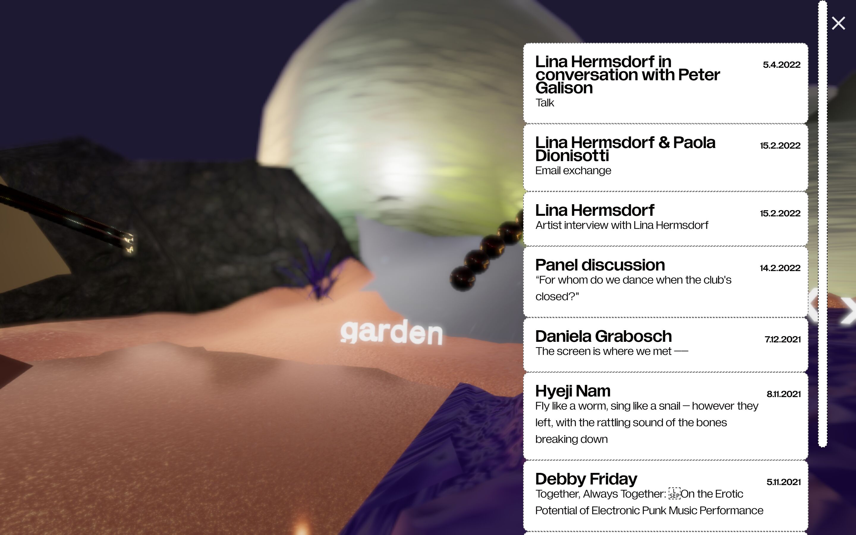
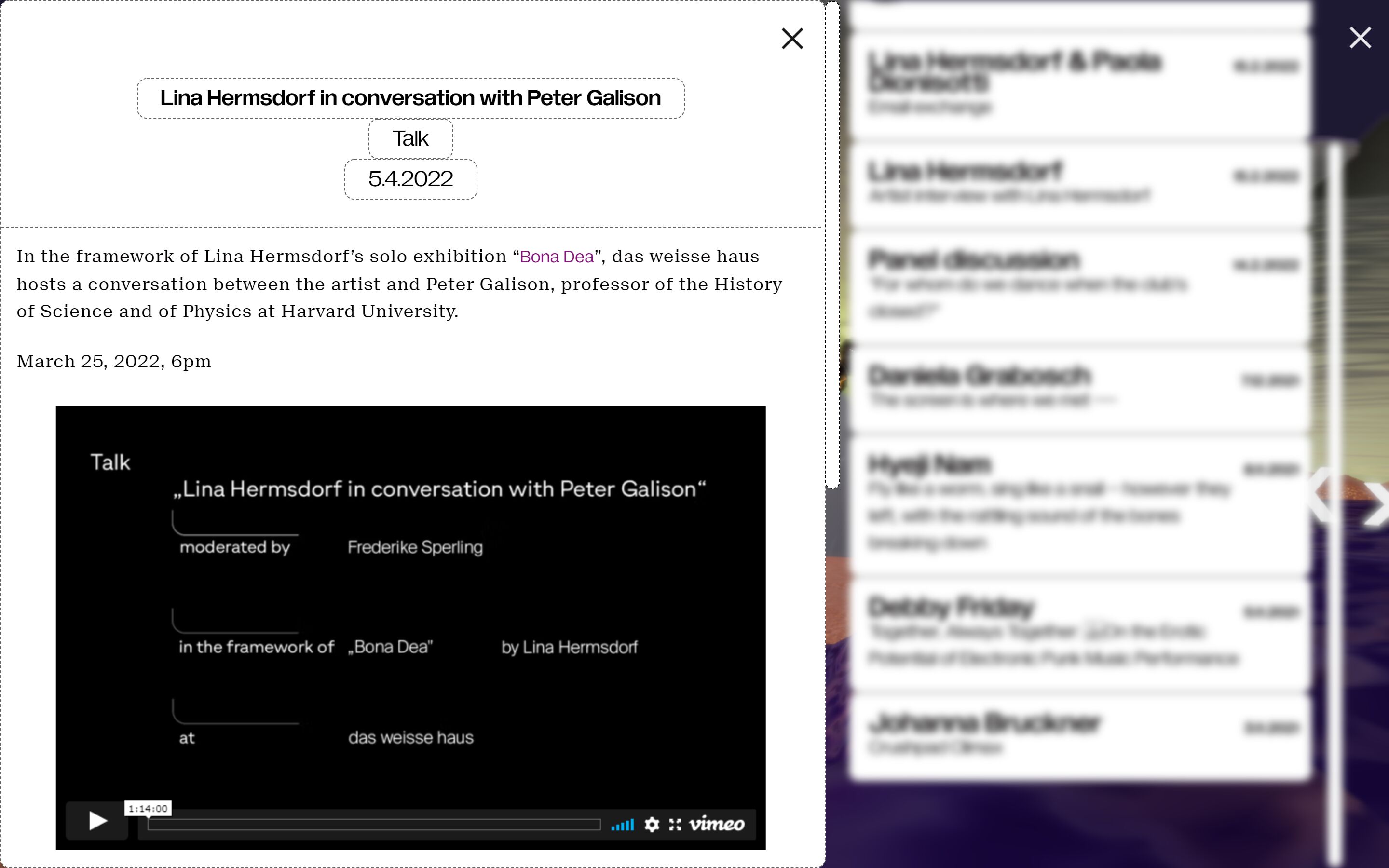
dwhX
11 2021
The viennese art association das weisse haus wanted a new online space that could serve as a platform for digital experimentation: dwhx.space. Together with the designer Alyona Chiobanu, we drafted a 3D environment that hosts texts, audio and video files. For me it was the first time working with 3D elements on the web in such a scale, which was a challenge. But the open source library react-three-fiber in combination with next.js made things a lot easier.
Fonts in use: Gramatika & Suisse Neue.
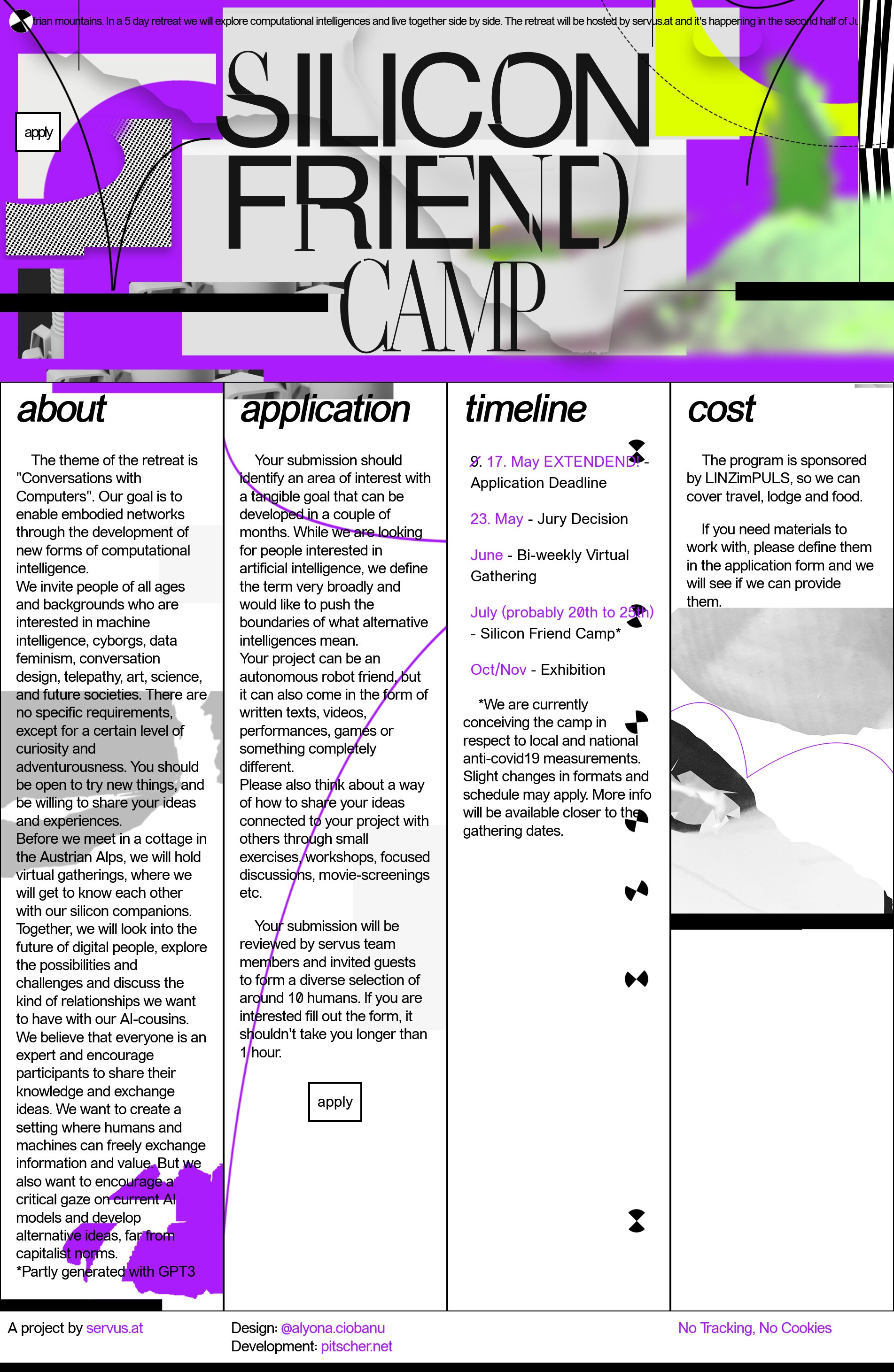
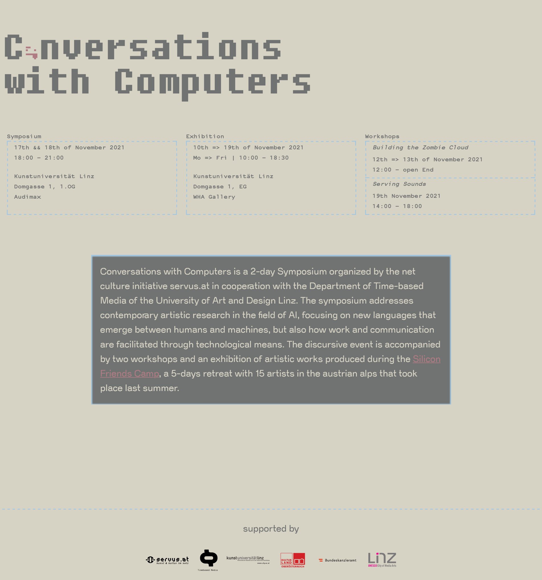
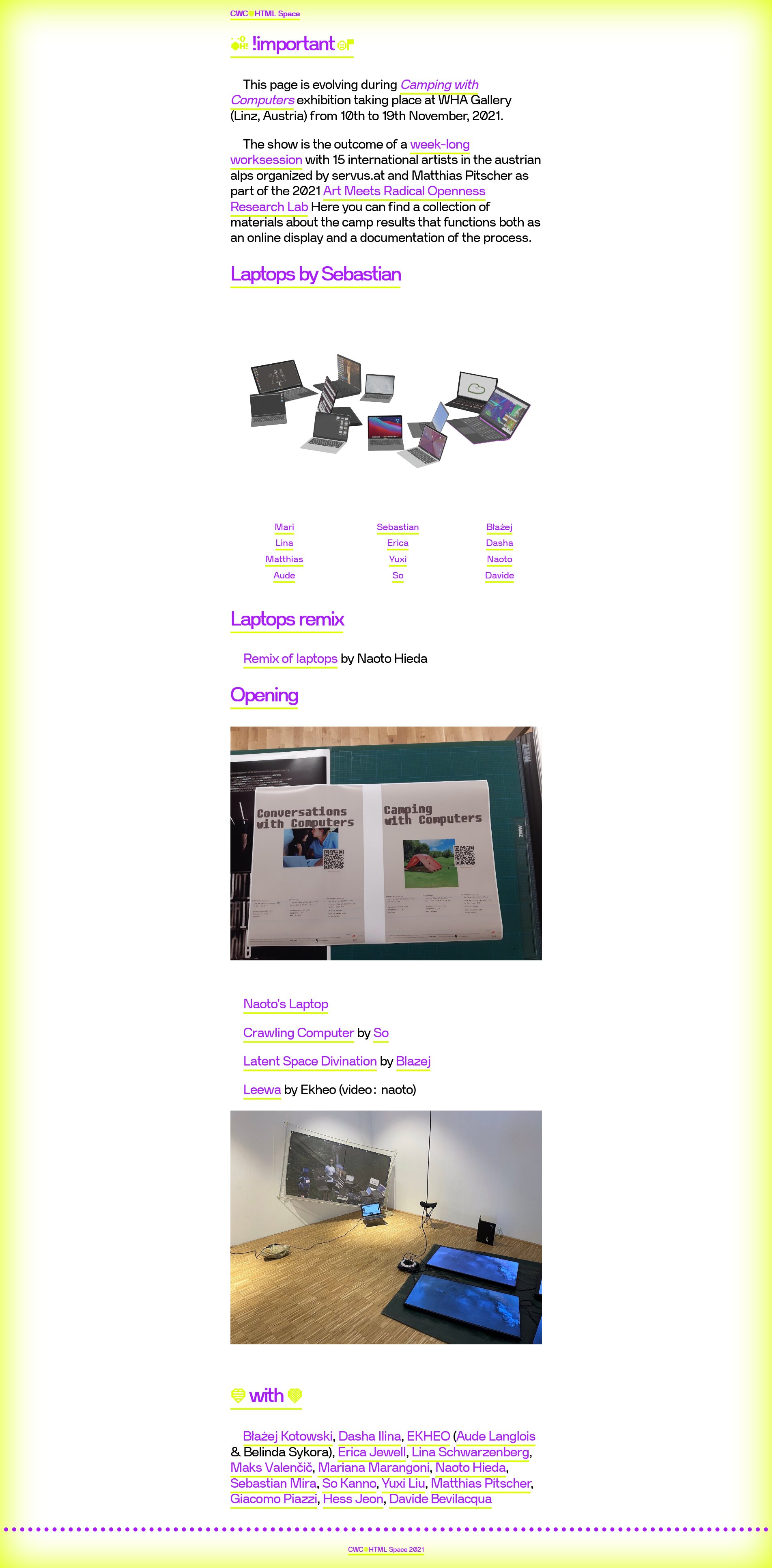
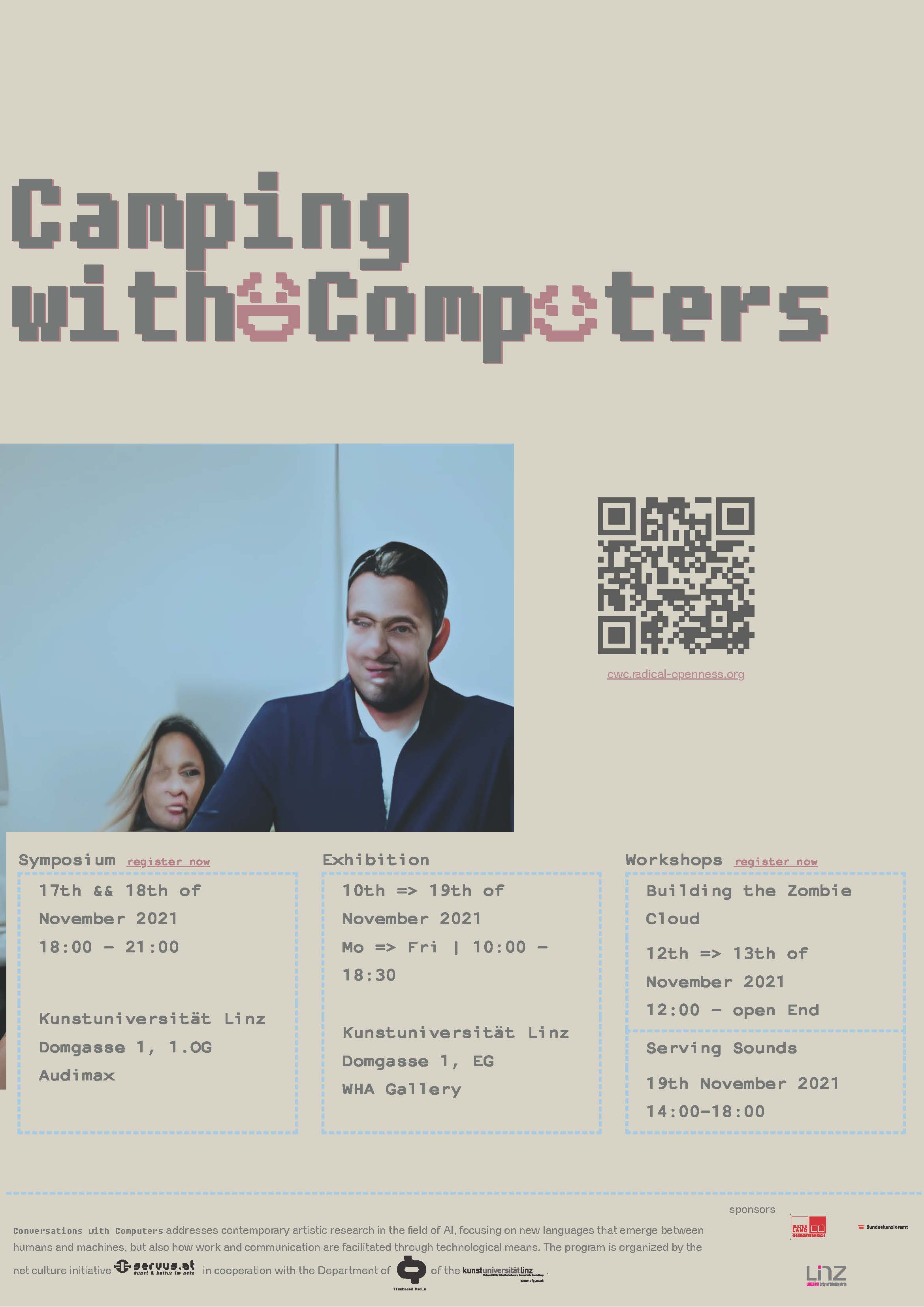
Silicon Friend Camp
08 2021
With the net culture initiative servus.at I organized a summer camp in Austrian Alps. For the Open Call we distributed a website that was designed by Alyona Ciobanu and hand coded by me.
For the related symposium website I decided to use a more neutral tone that took inspiration from old terminal computers.
The layout of the posters were generated with JavaScript and the images were generated with ruDalle, a text-to-image AI model.
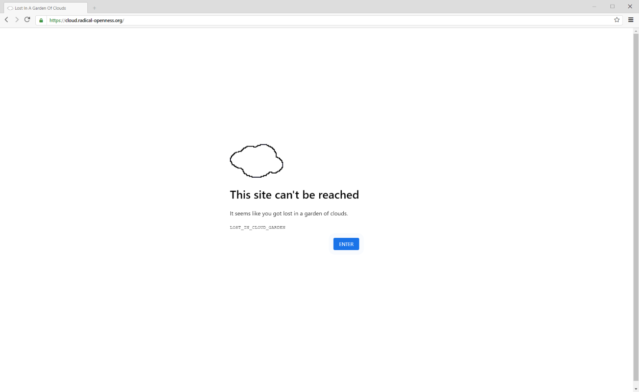
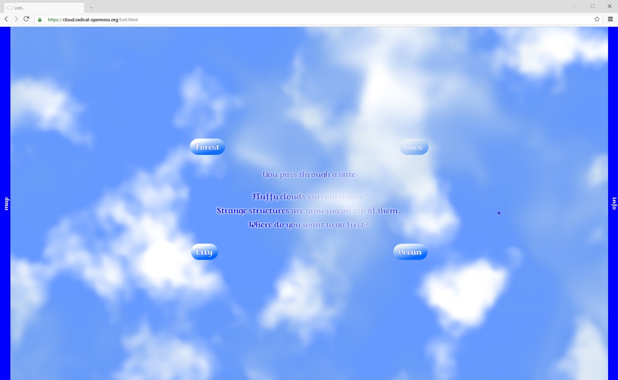
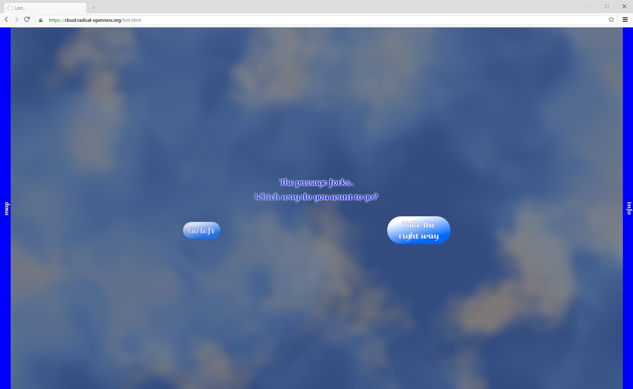
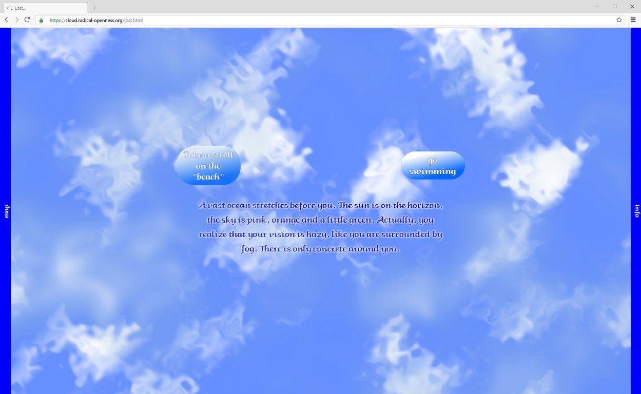
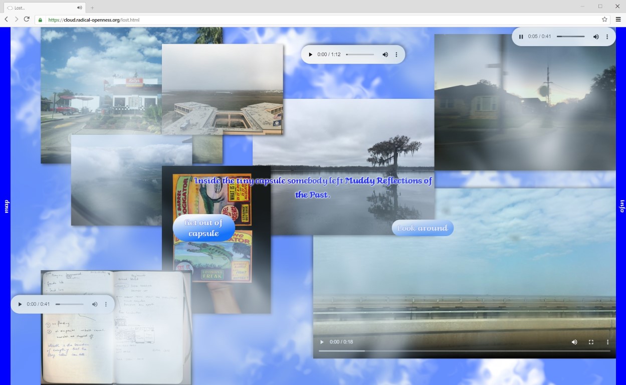
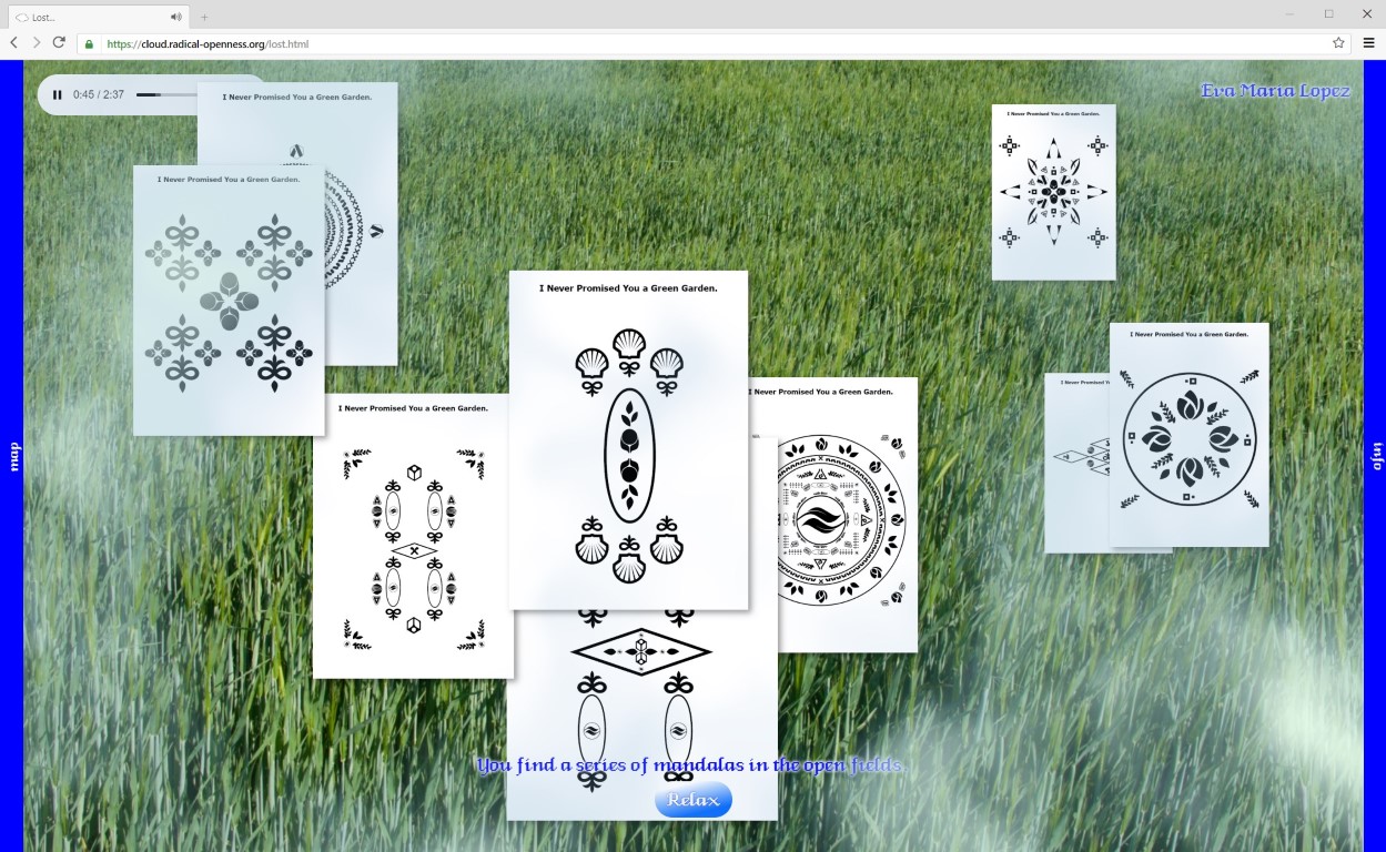
Lost in a garden of clouds
05 2020
As the artist duo Sai Bao & Yang Mu we were invited to create the online exhibition for the festival »Art Meets Radical Openness 2020« in Linz. Early on we decided to create a text adventure, where the visitor walks in circles exploring multiple dimensions of interacting with the artworks. I used a custom shader to render the clouds live. Everything is hand coded using iframes as the core mechanism.
Font in use: Fancycube. A remake of Bill Atkinson's Venice.
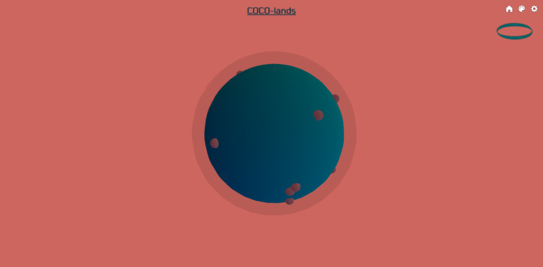
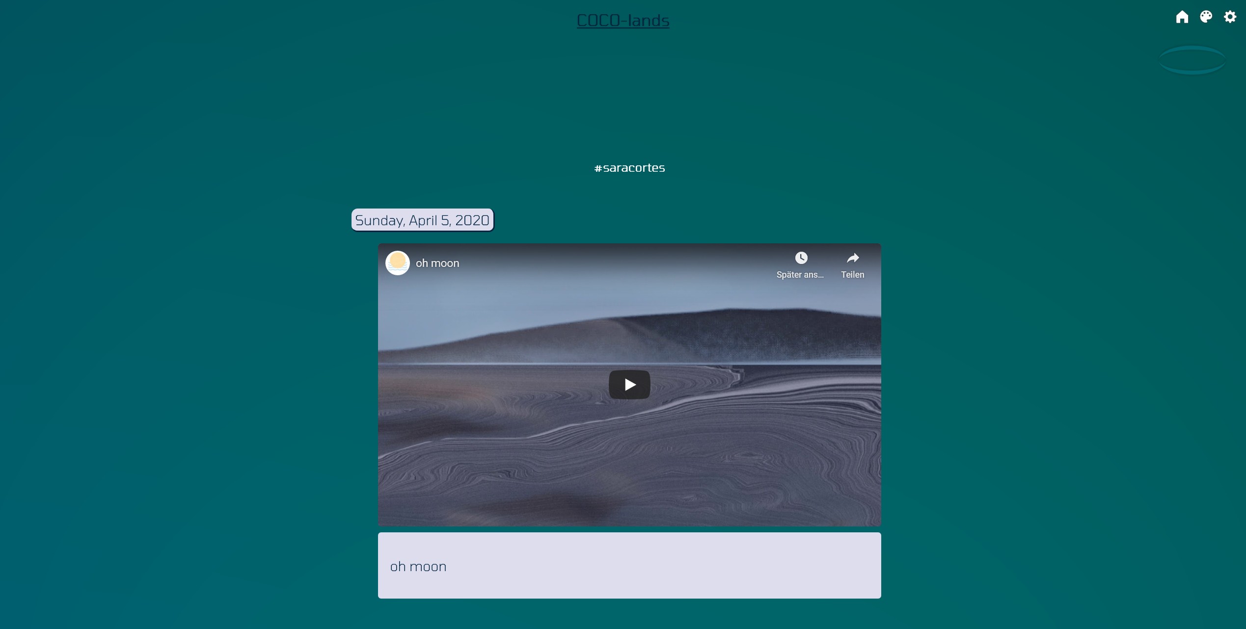
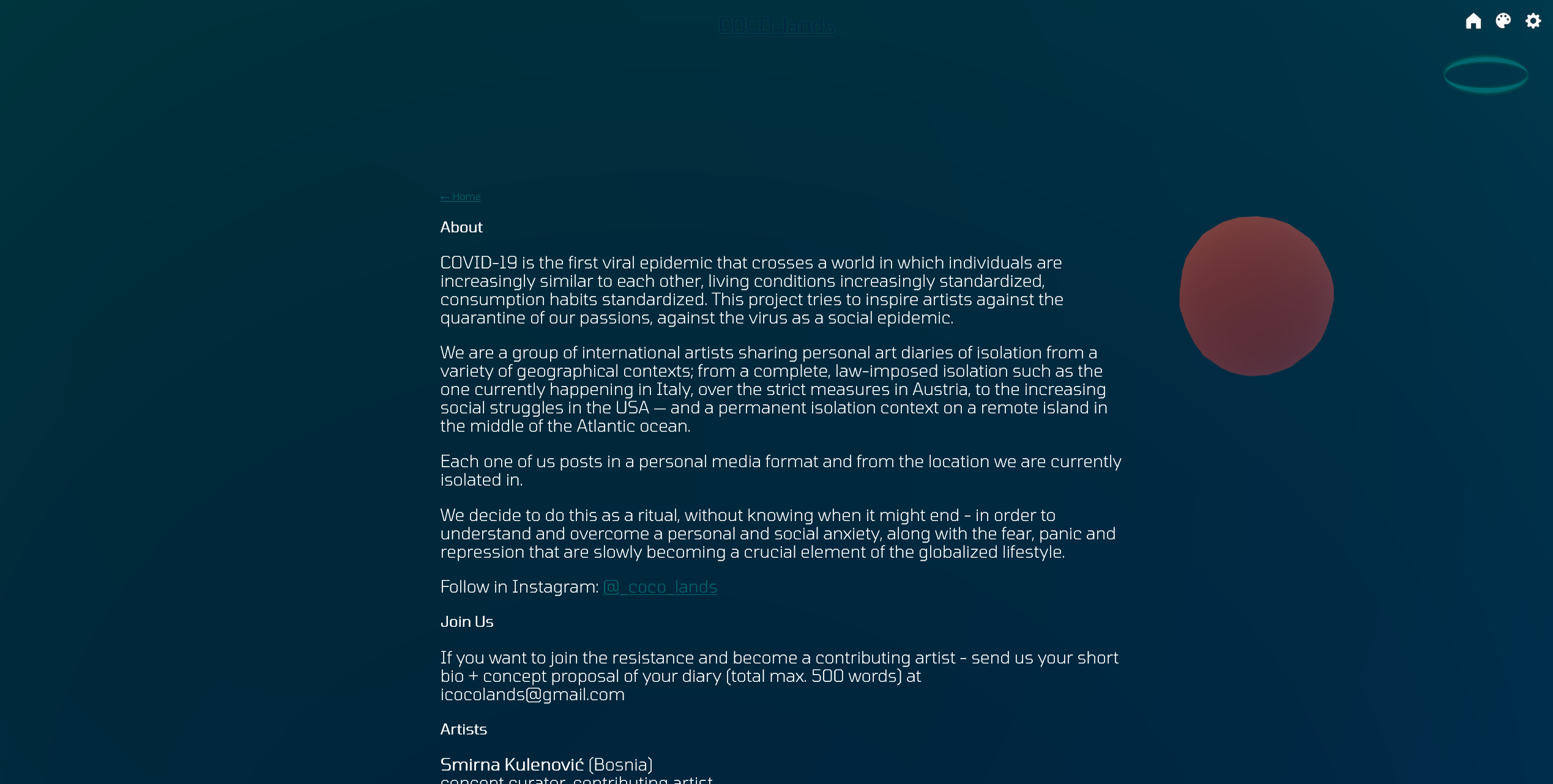
coco lands
03 2020
With a group of international artists we initiated coco lands to start a collaborative diary during the coronavirus pandemic. With Juan Pablo we created a website to collect our creative outputs. The page is running on tumblr with a custom template, utilizing threejs for 3D rendering.
Font in use: Tomorrow
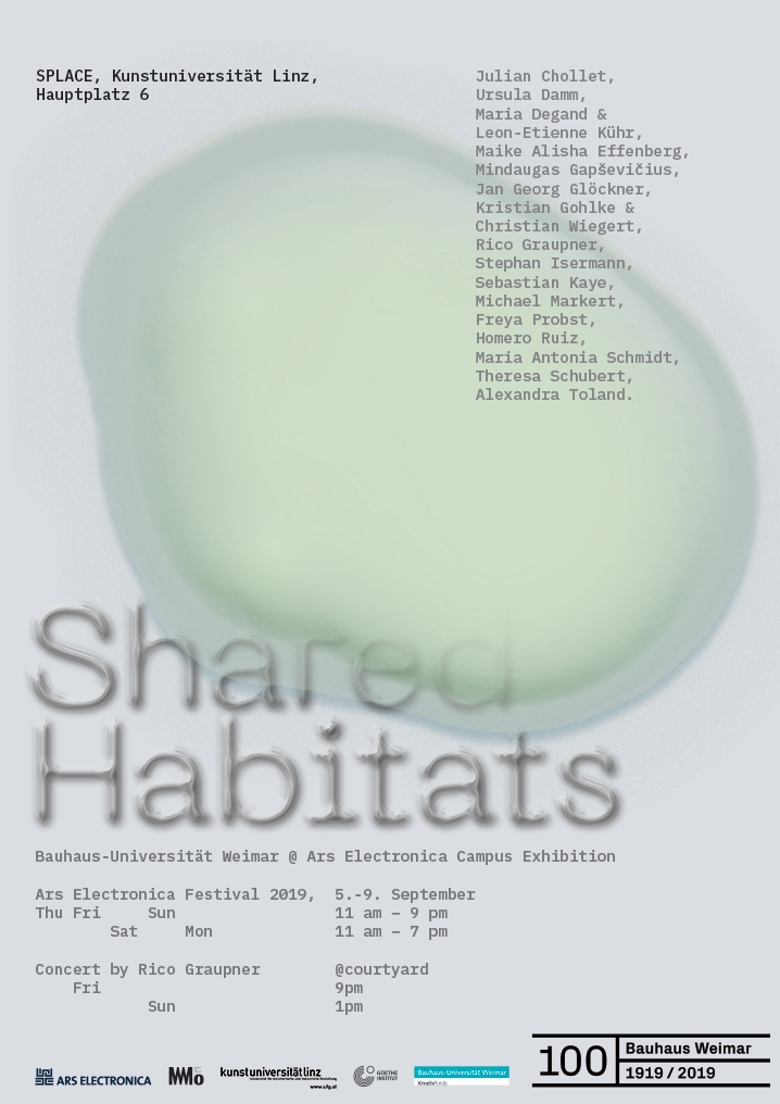
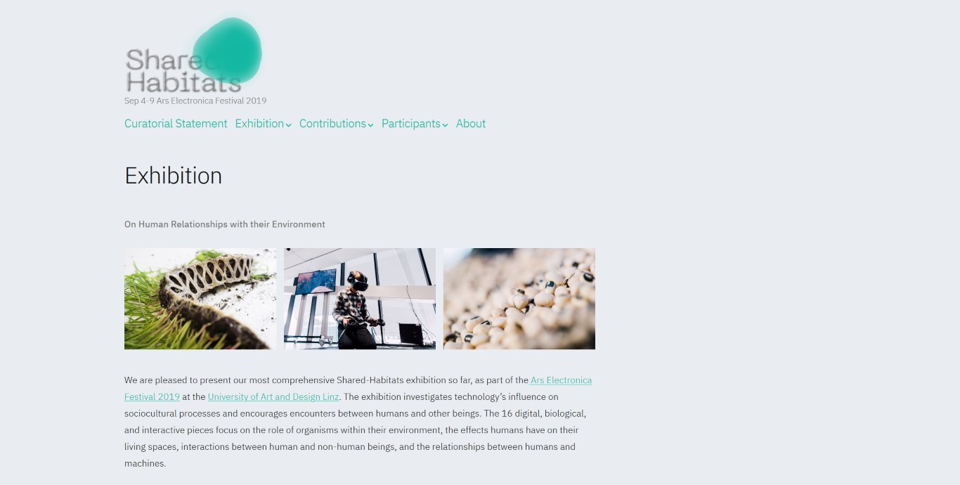
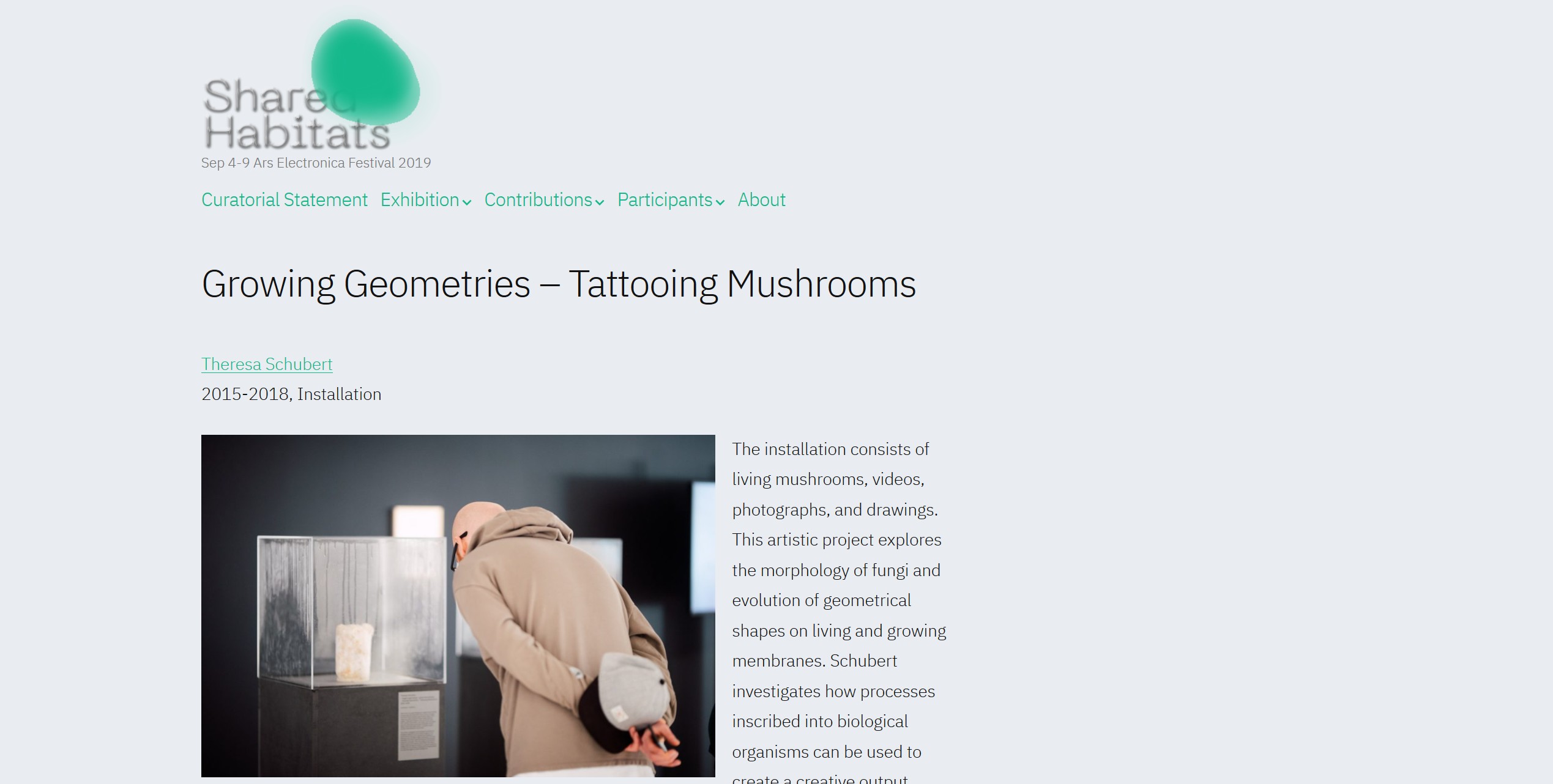
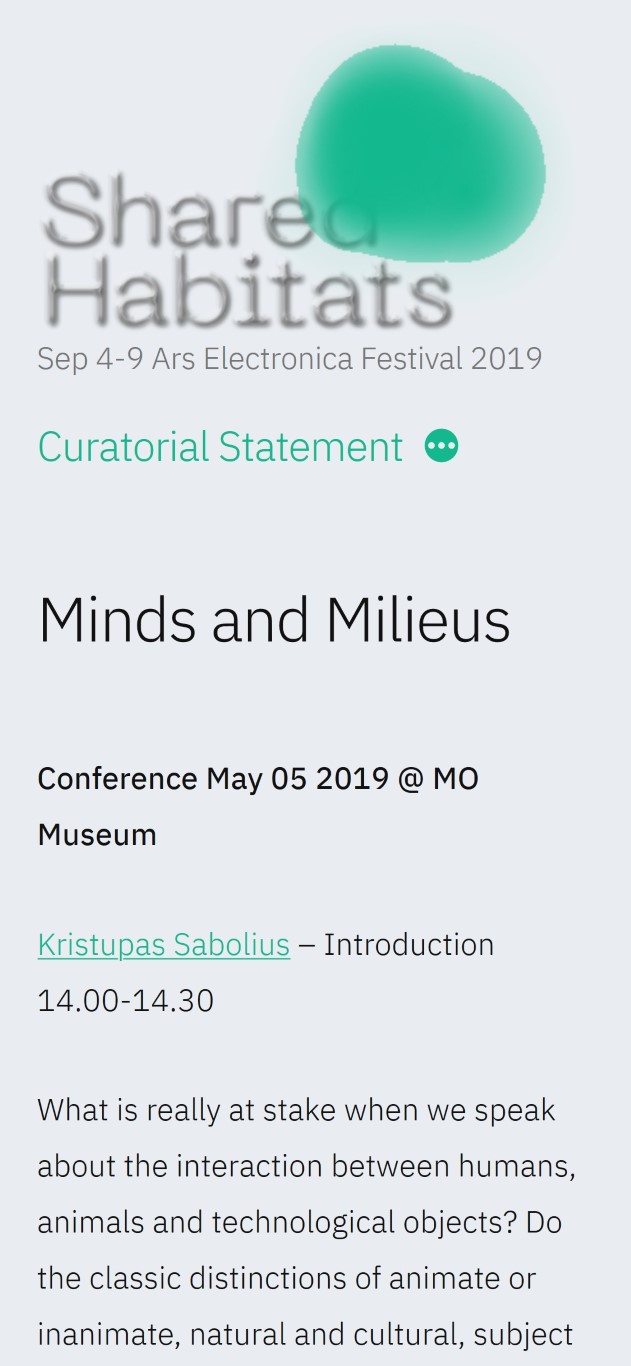
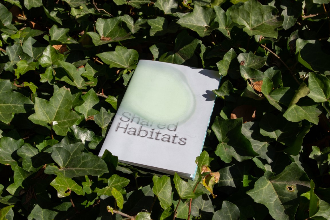
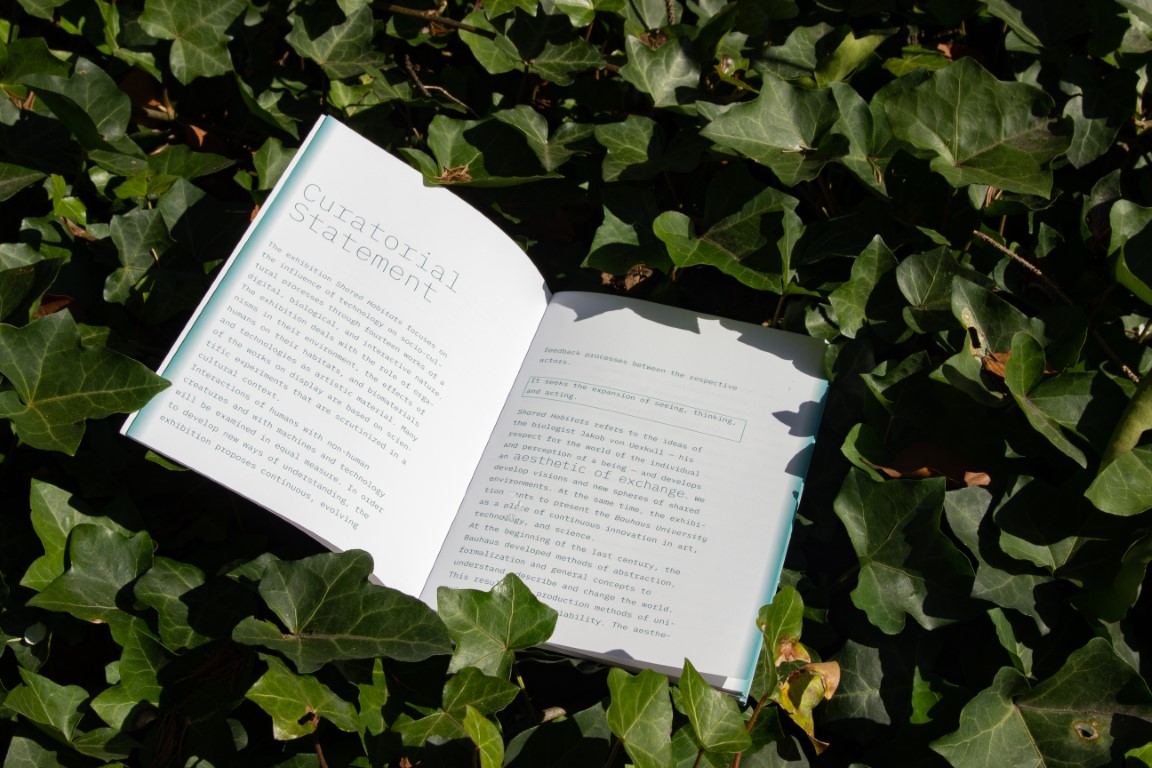
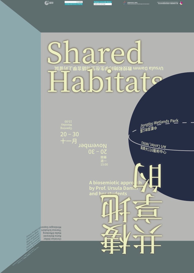
Shared Habitats
08 2019
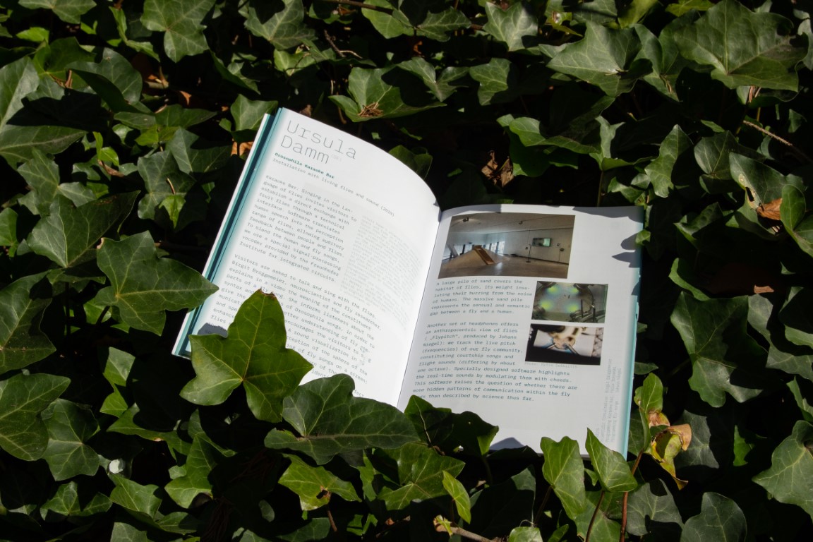
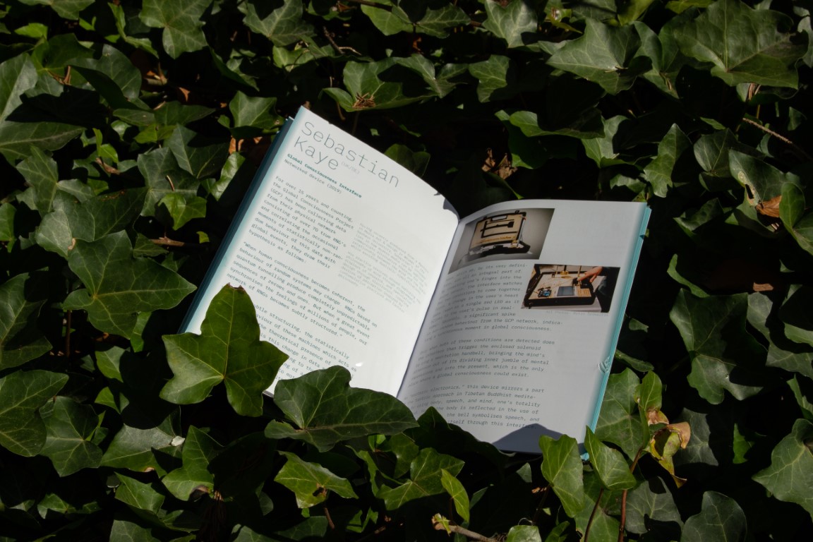
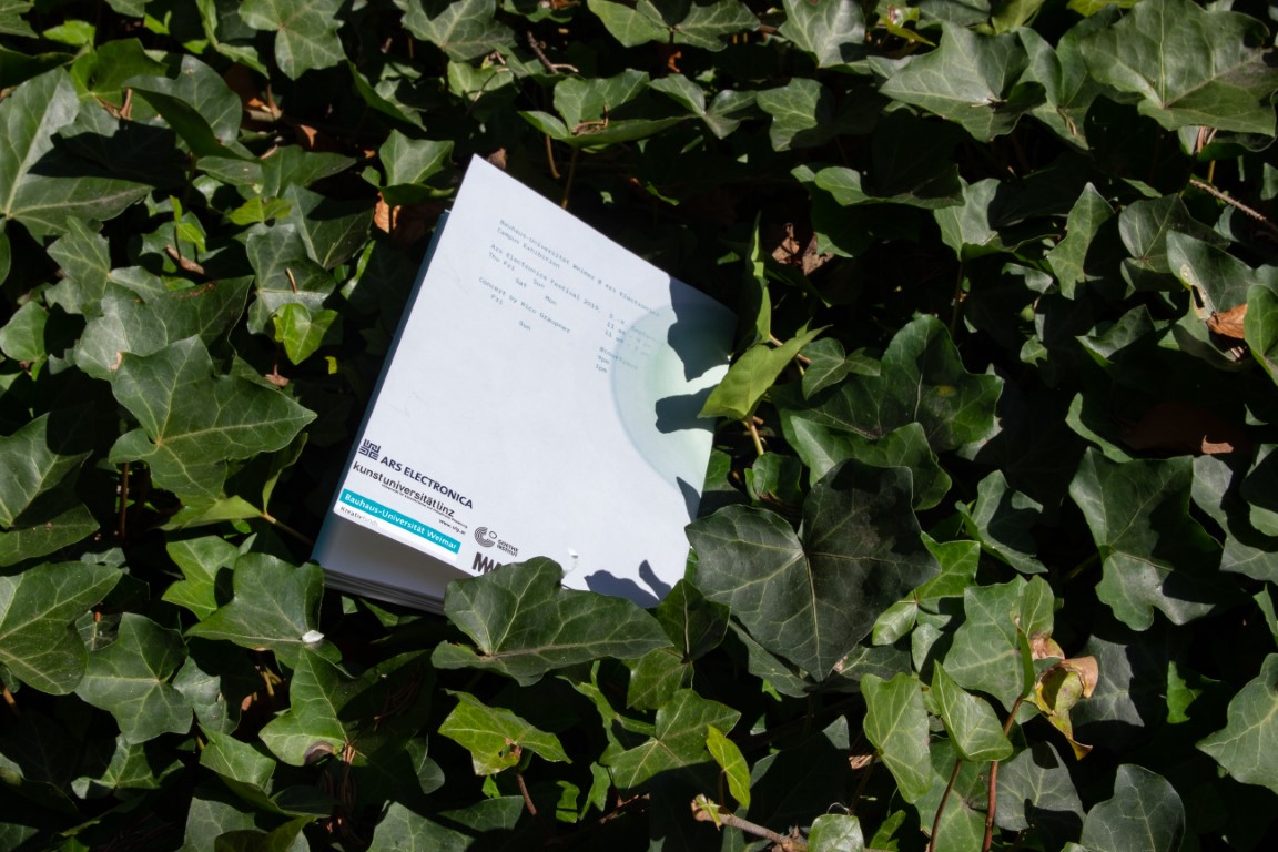
As part of the Ars Electronica festival, the Bauhaus Uni organized another Shared Habitats exhibition. I worked with Ursula Damm, Theresa Schubert and Mindaugas Gapševičius on the visual identity. A generative, organic looking, blob was used as the main icon on the website, a poster, booklets & stickers.
Fonts in use: Neue Machina, IBM Plex Mono
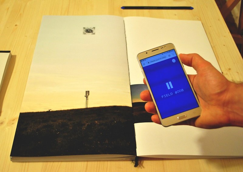
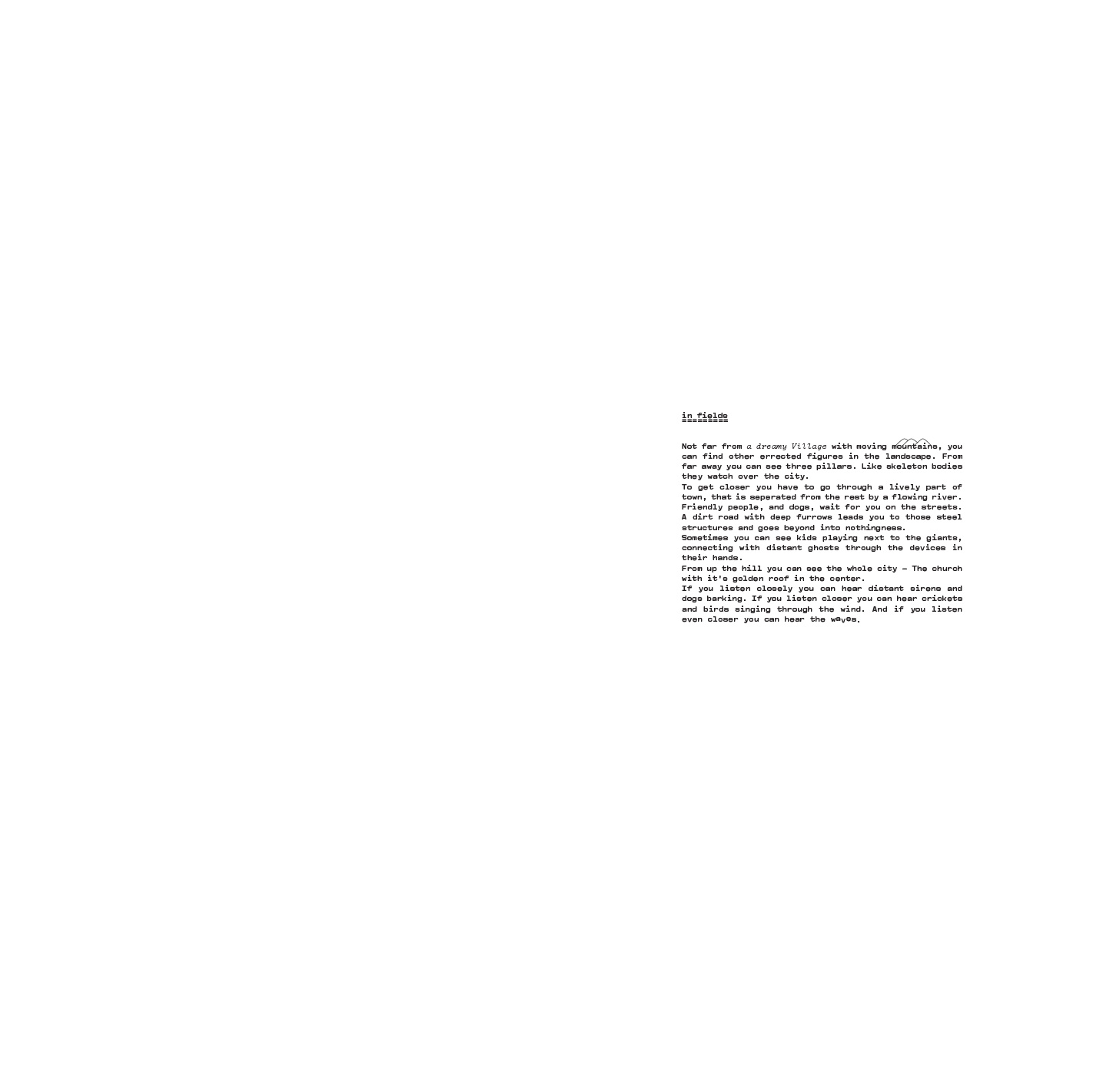
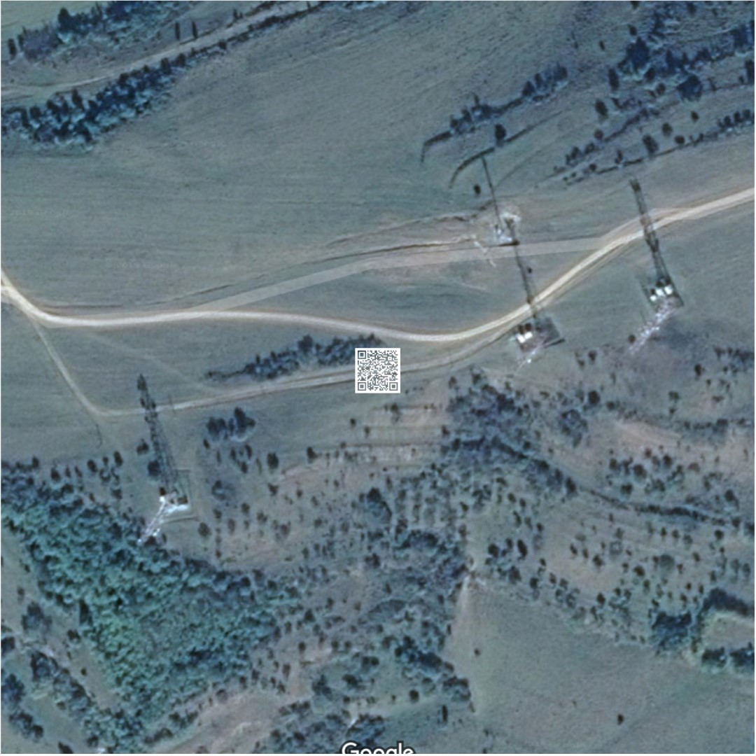
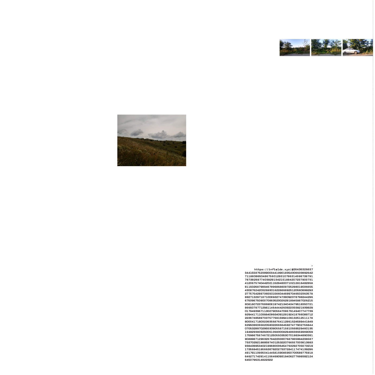
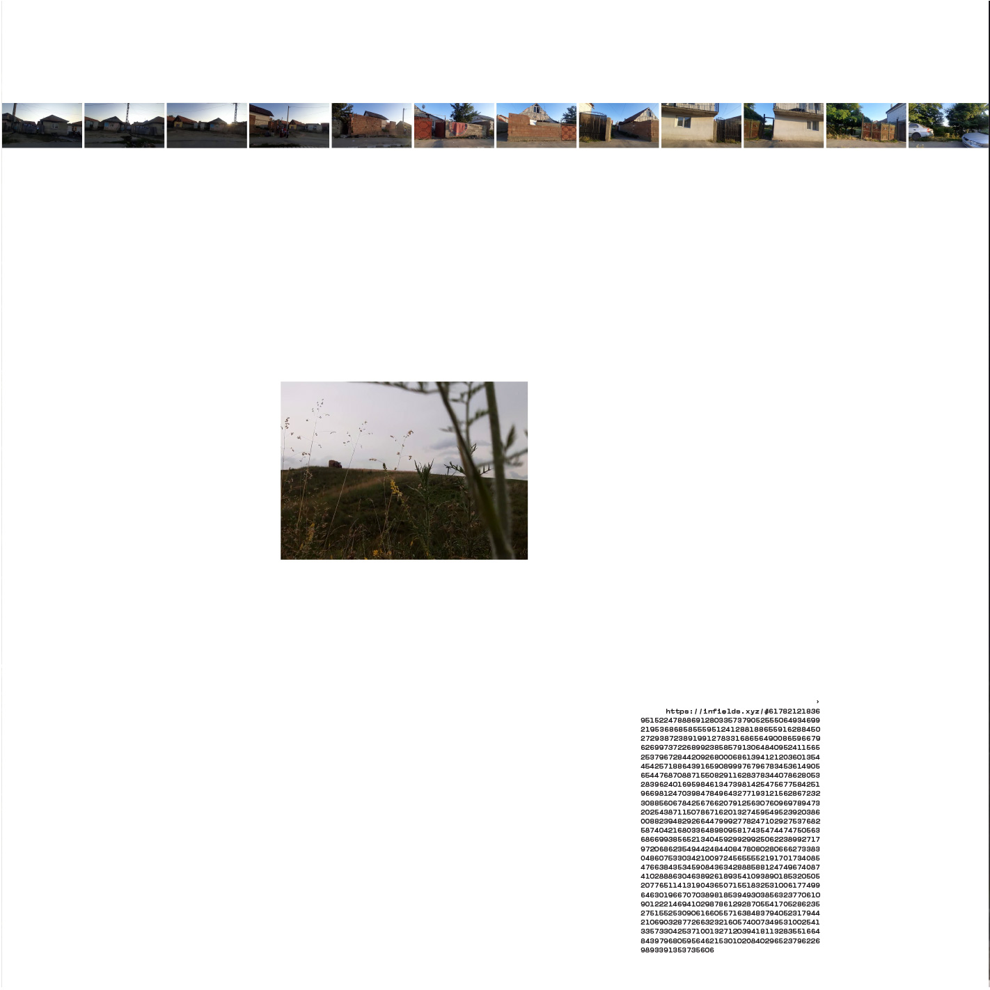
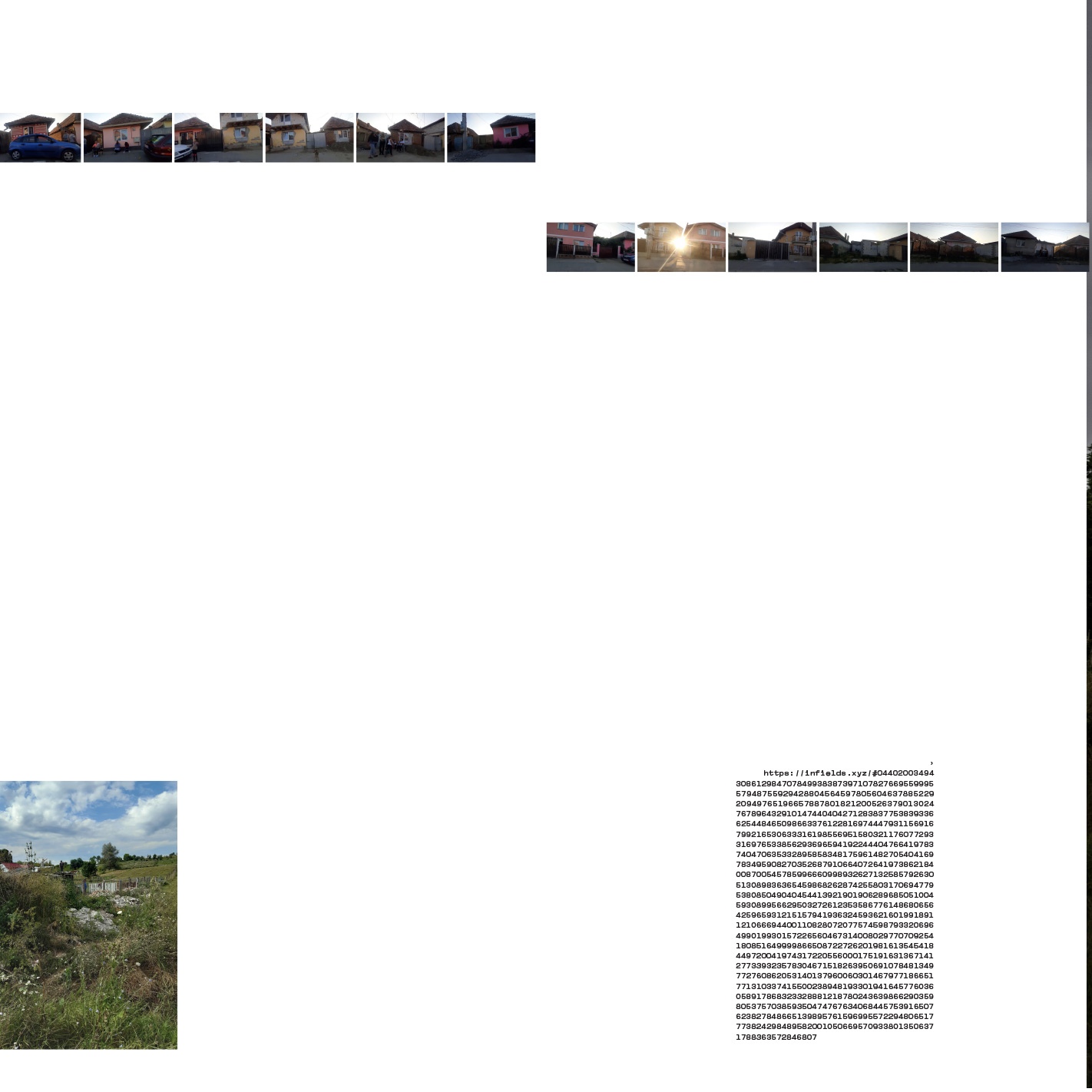
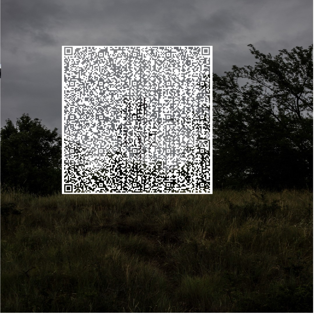
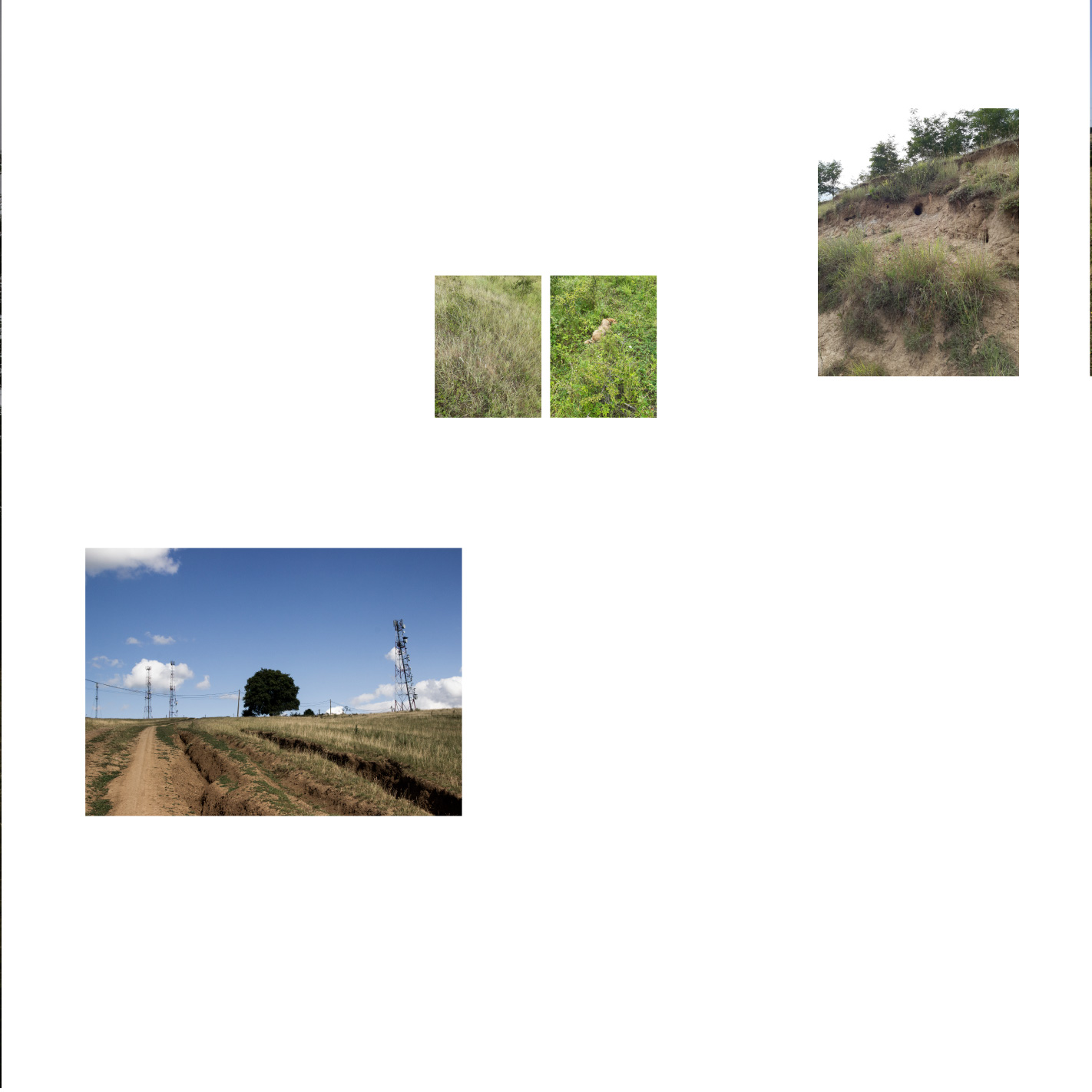
infields
07 2019
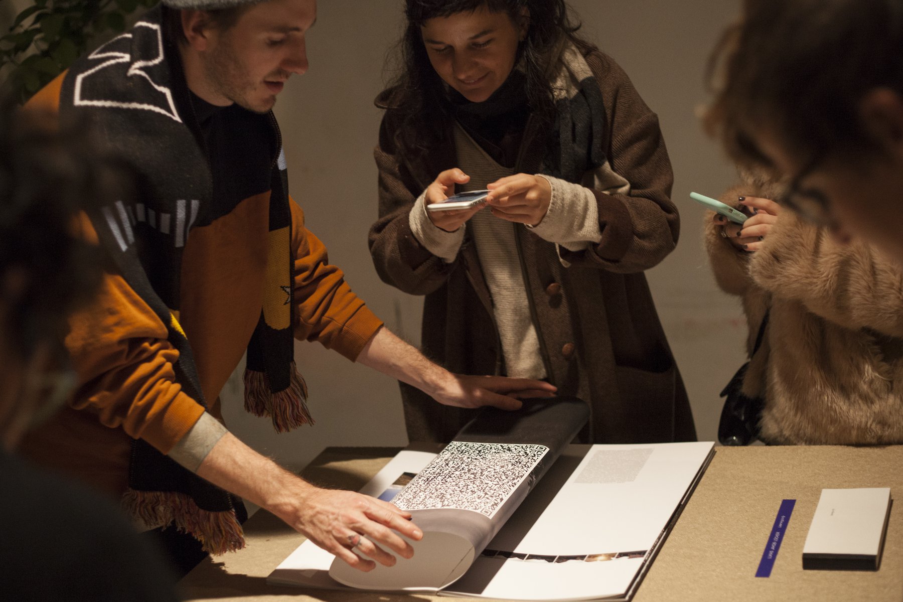
infields connects field recordings of a rumanian cell tower site with a printed publication. The site is located close to Făgăraș and consists of 4 towers sending radio and cellular signals. To connect to the soundfiles you need to scan the QR codes in the book.
The project was published as part of the sounds like a book residency and the book was produced by Graphomat.
Size: 25cm by 50cm
Edition of 5
images by Eliot & revista22
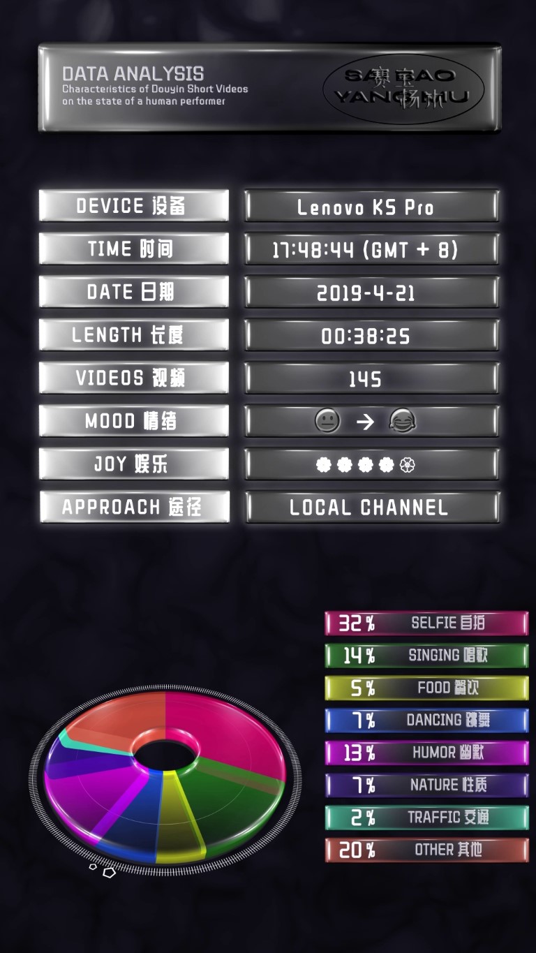
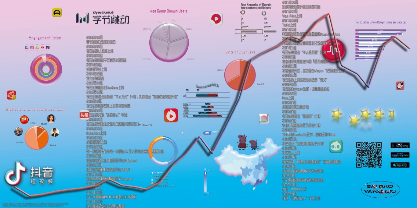
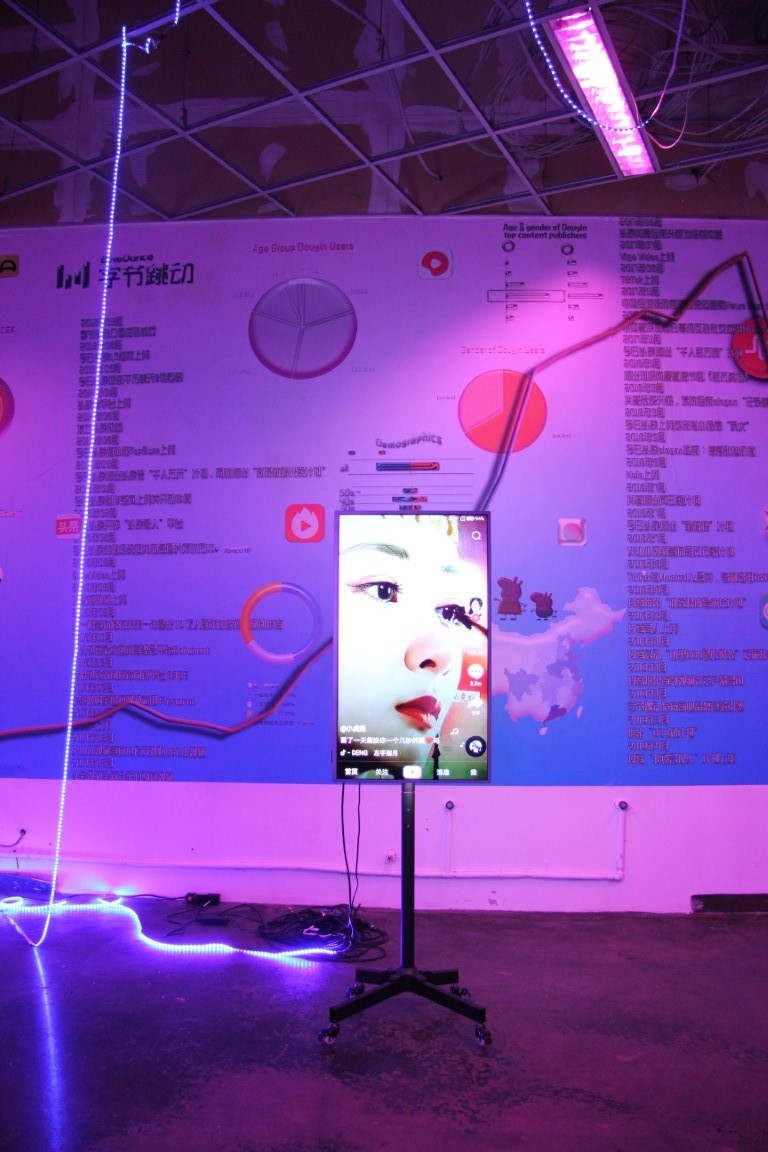
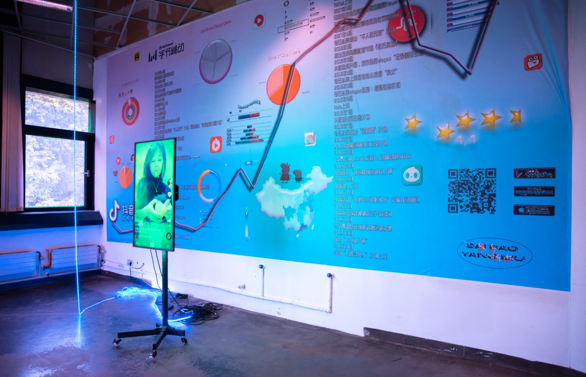
Meanwhile in China
04 & 10 2019
As part of the artist collective »Sai Bao & Yang Mu« we created two installations that deal with the fact that the app Tik Tok is called Douyin in mainland china and only features chinese content.
The first version was exhibited at the Xie Zilong Photography Museum in Changsha featuring a 7 channel video installation with animated graphics.
The second was exhibited at Ars Electronica with a 6x3m wallpaper and a single channel video.
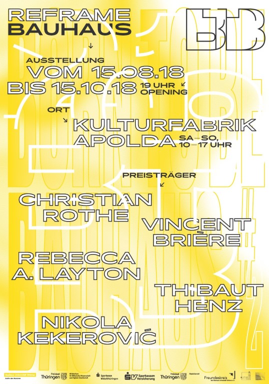
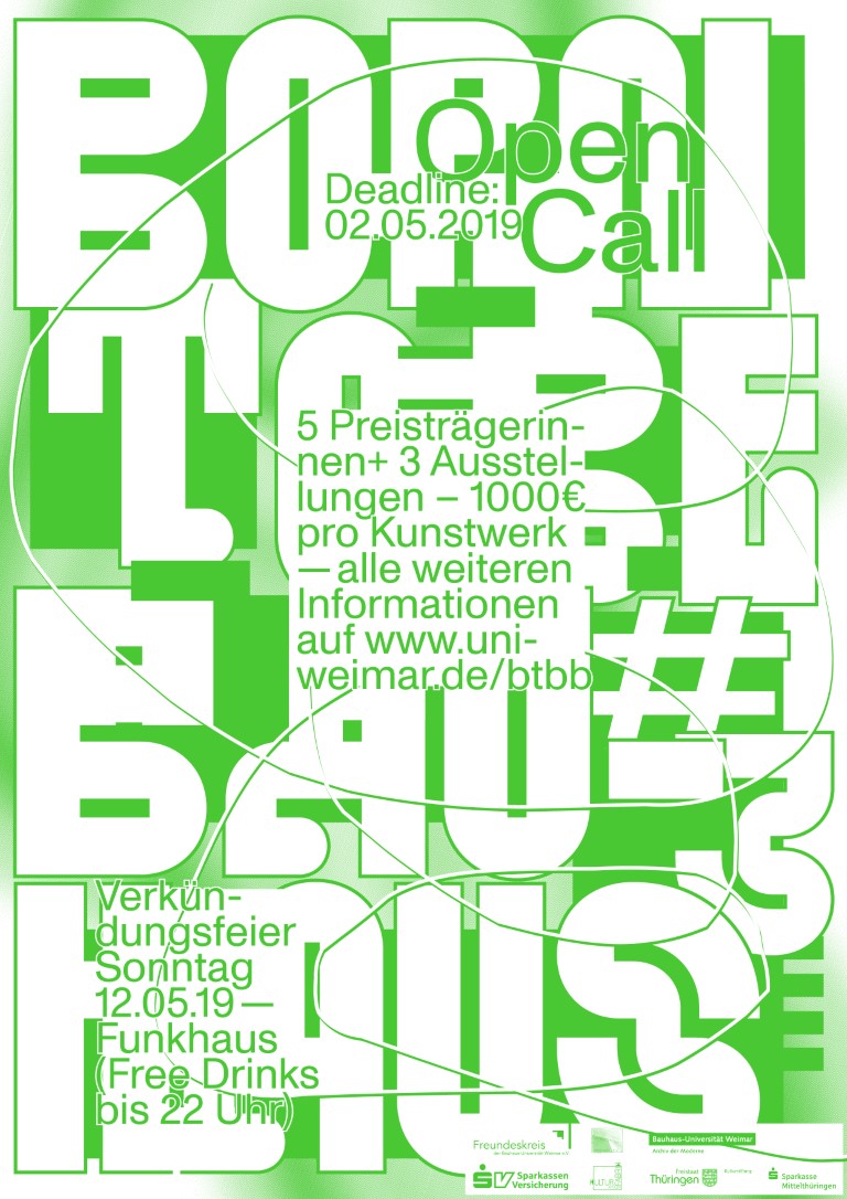
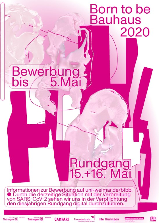
Born to be Bauhaus
2018-2023
Together with Adrian Palko we created the identity for the annual art prize Born to be Bauhaus. Each year is represented by a bright neon color. Posters are printed in offset with a special colors.
The page is a progressive web app, built with nuxtjs.
Fonts in use: Monument Grotesk, Pano, Pickle
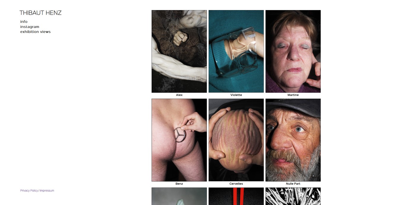
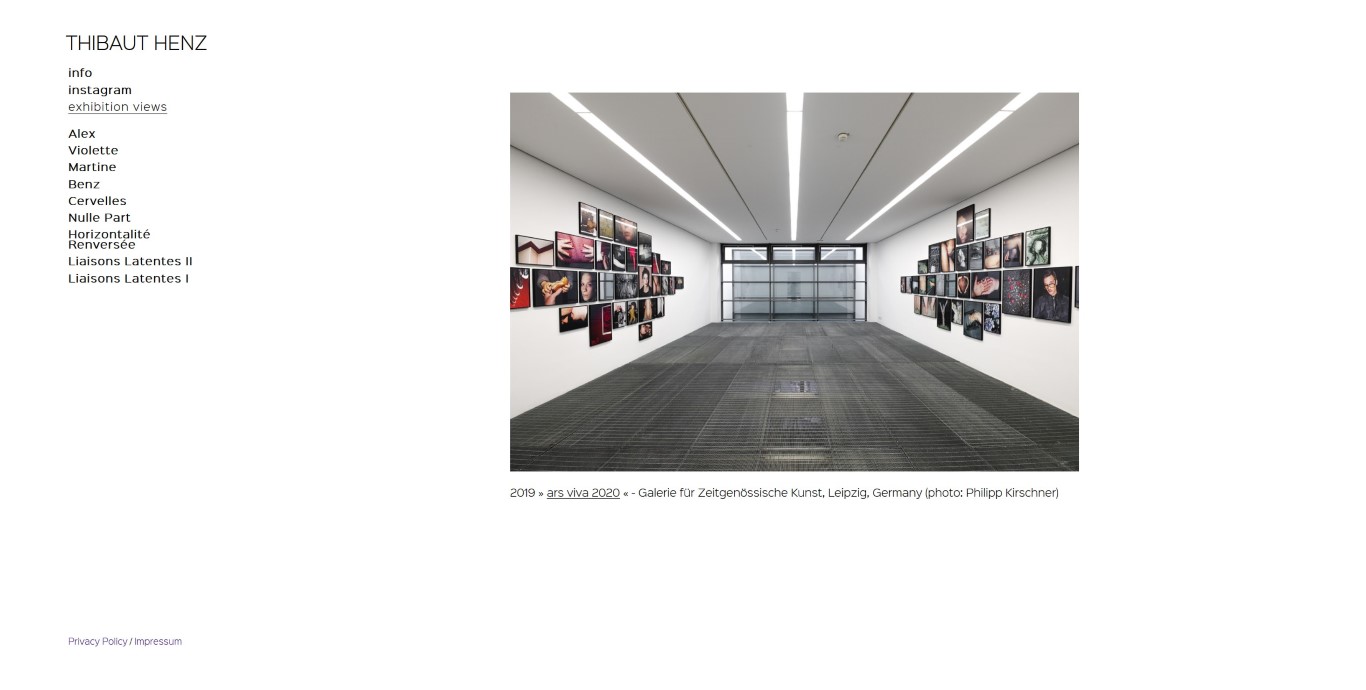
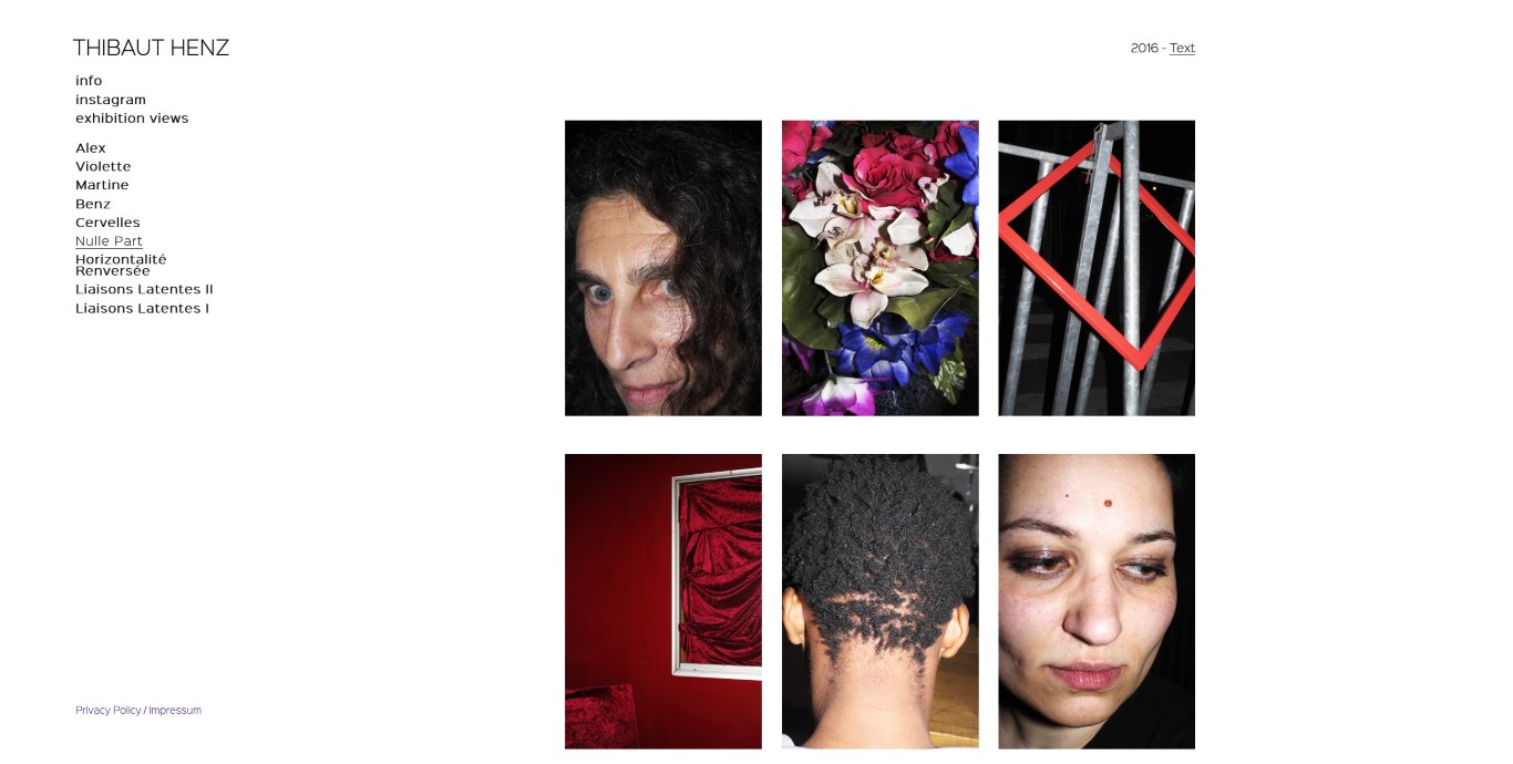
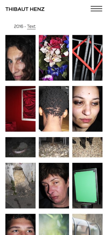
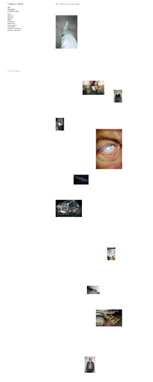
Thibaut Henz
03 2018
Online portfolio for the photographer Thibaut Henz. We decided on a customized version of the wordpress lay theme, which gives him the ability to arrange images in interesting ways.
Font in use: Sinkin Sans
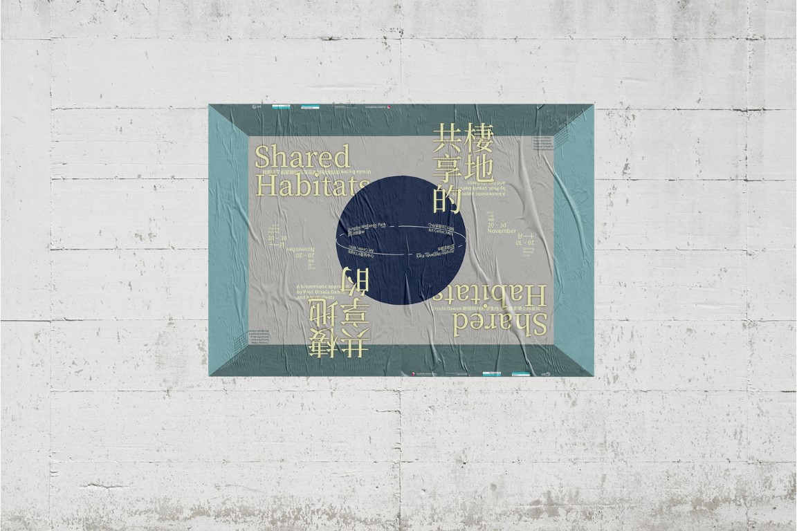
Shared Habitats
06 2017
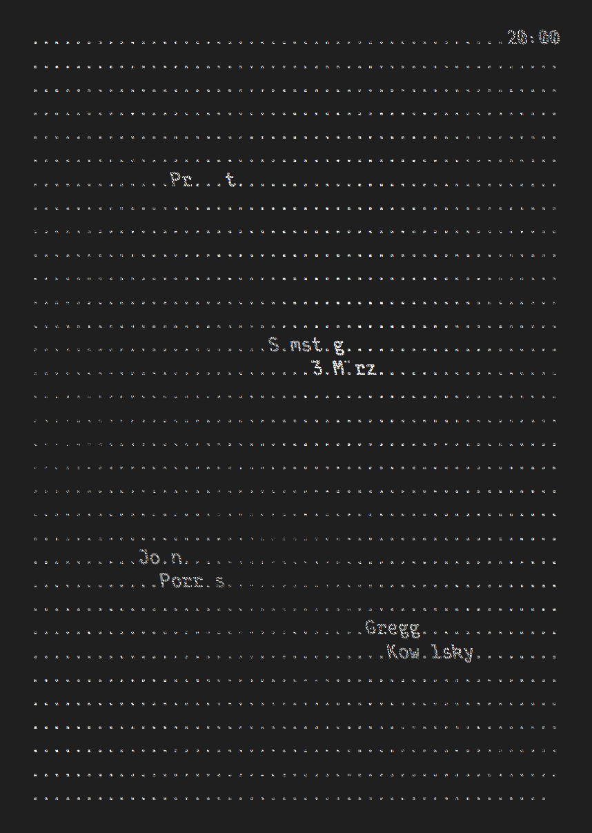
I had the pleasure to design a Poster for the exhibition “Shared Habitats” in Kaohsiung. Ursula Damm and her students are exhibiting media art works that deal with the environment (Umwelt). The poster can be flipped upside down and two posters together remind us of our shared habitat.
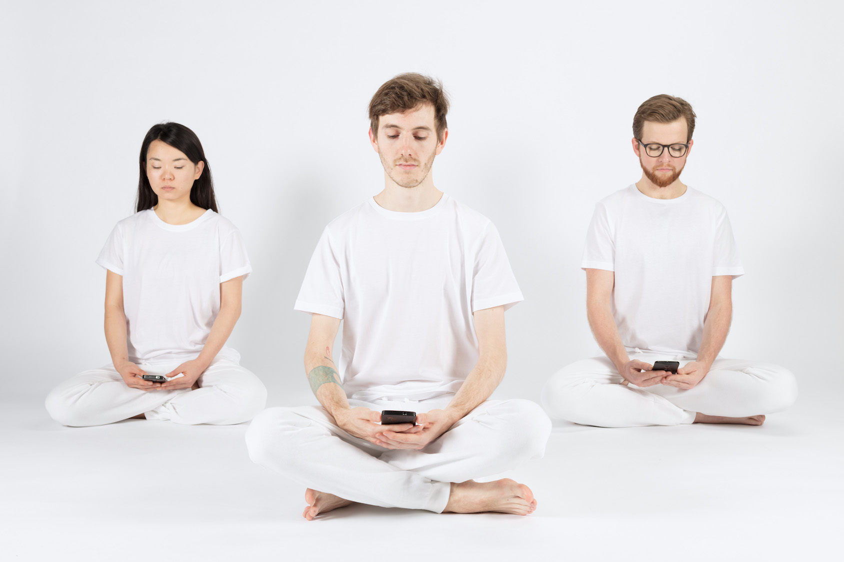
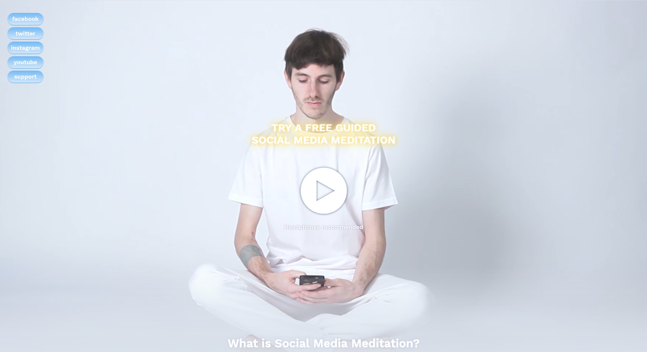
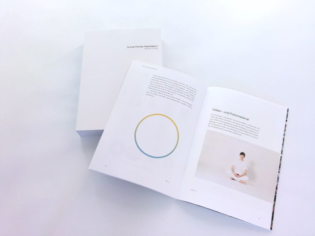
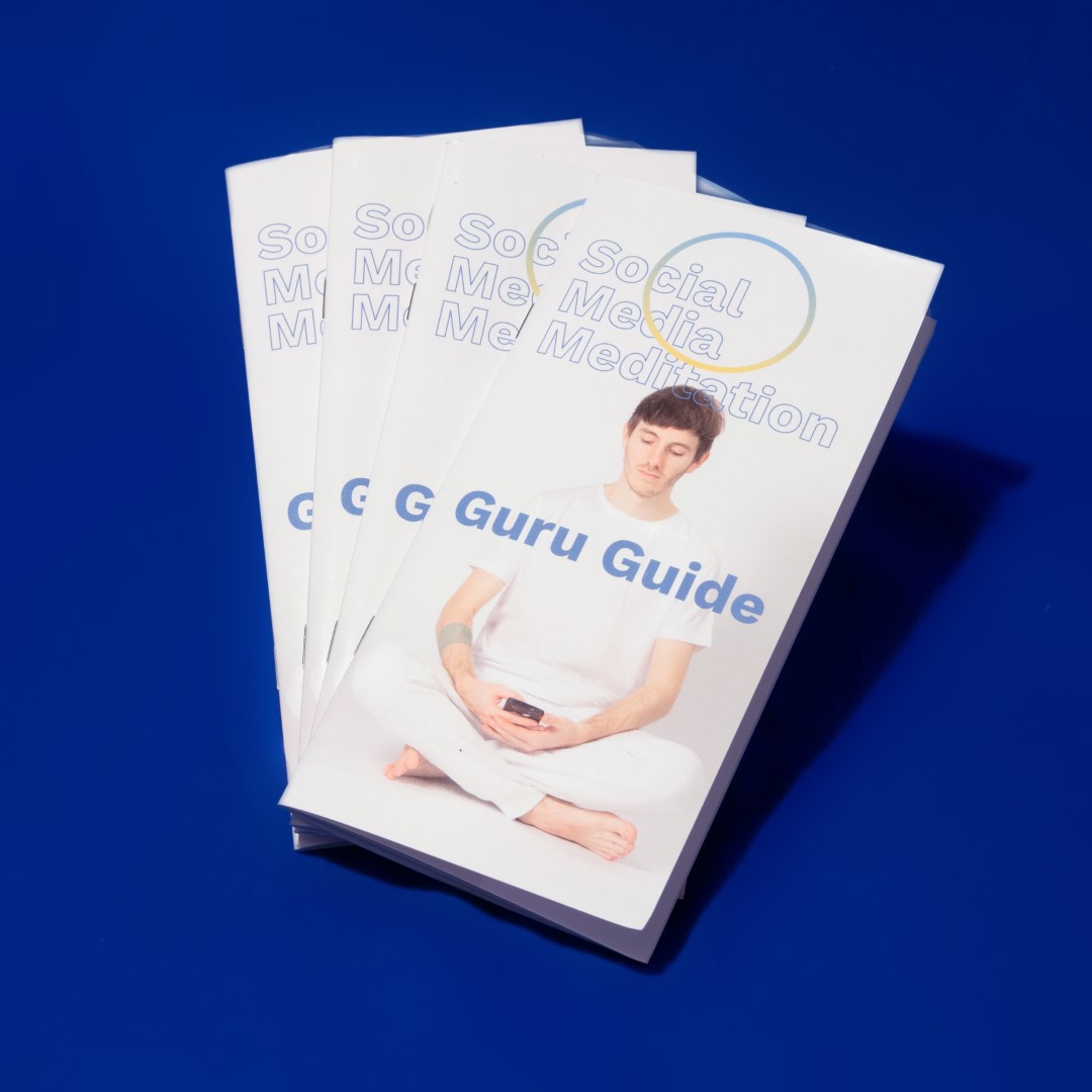
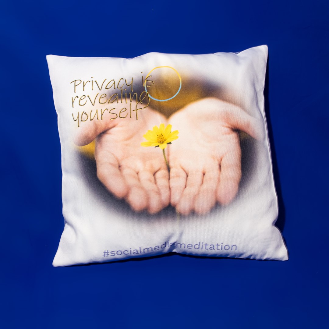
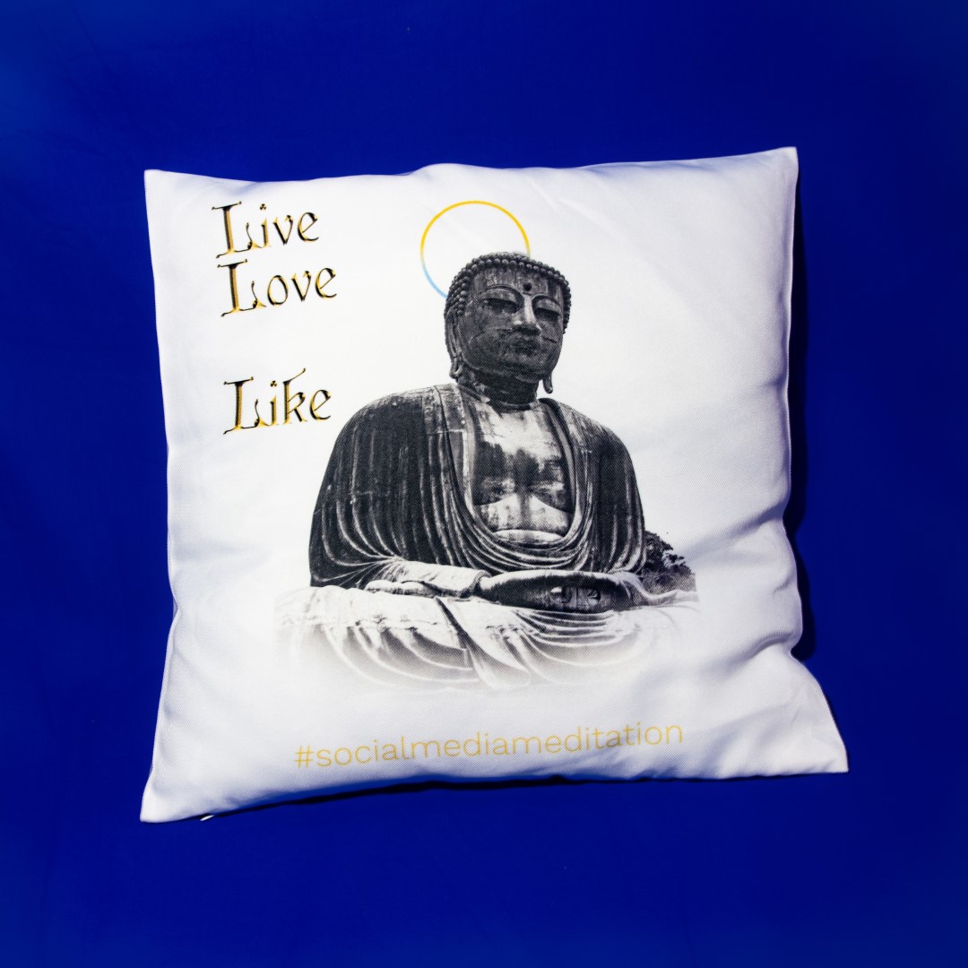
Social Media Meditation
04 2017
For my thesis project I created a visual language that mimics contemporary yoga and meditation institutes.
This speculative brand is based on the idea of nothingness. The logo got stripped away from any iconic form.
The promotional pictures resemble stockphotos.
More information: www.socialmediameditation.net
Even more information in my Thesis Book(german)
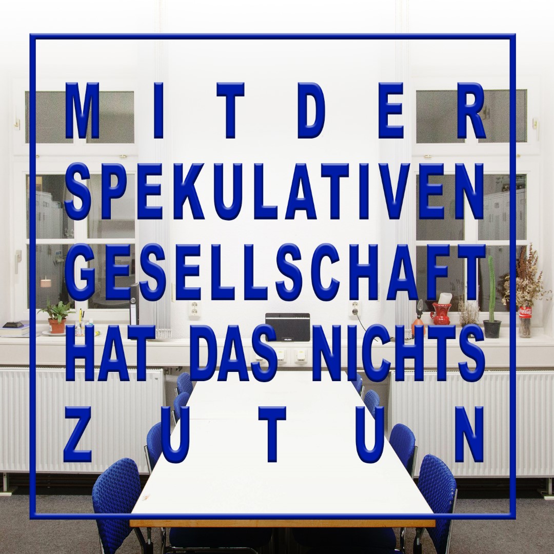
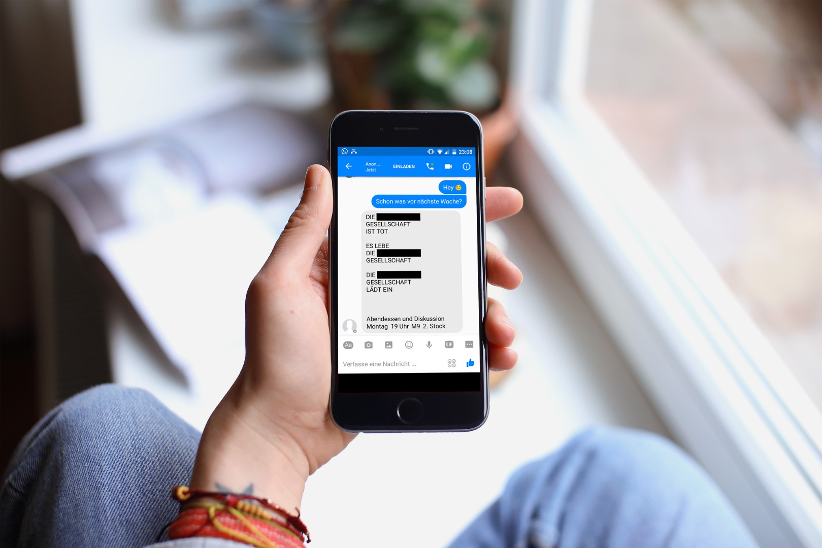
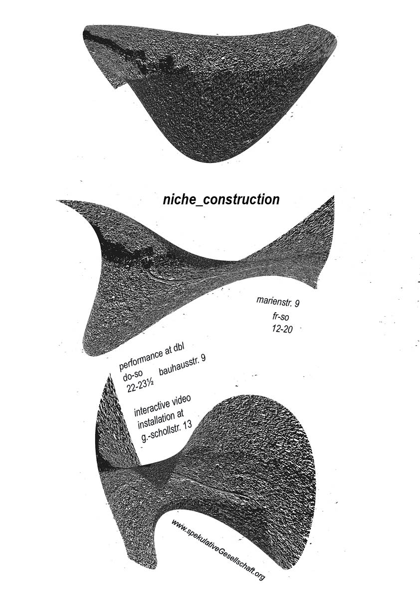
Spekulative Gesellschaft
2016-2017
The Speculative Society (Spekulative Gesellschaft) was an everchanging group of individuals that organized events, happenings and exhibitions. I created a lot of the recent graphics, like invitation cards, logos, posters and leaflets.
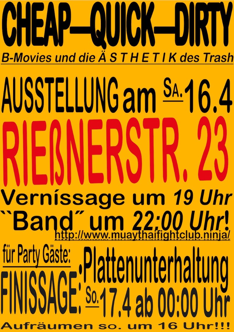
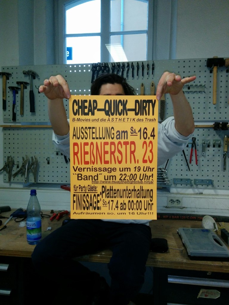
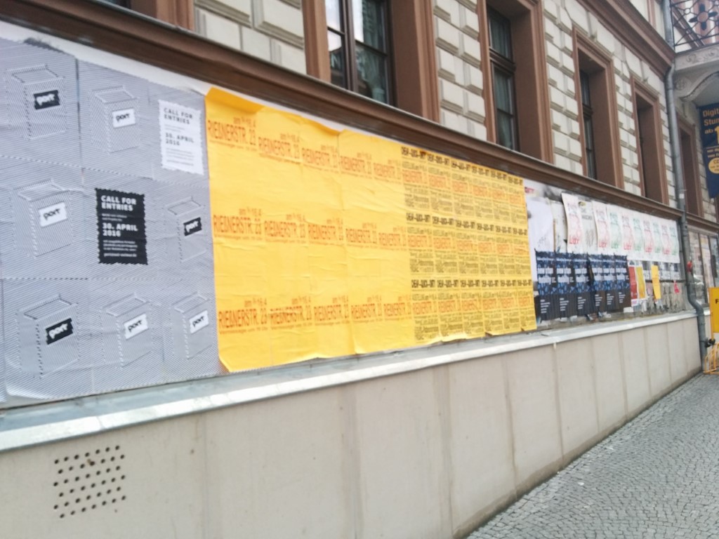
Cheap–Quick–Dirty
03 2016
Cheap and dirty posters for the exhibition called “Cheap Quick Dirty”, where students inventend B-Movies and created additional graphics.
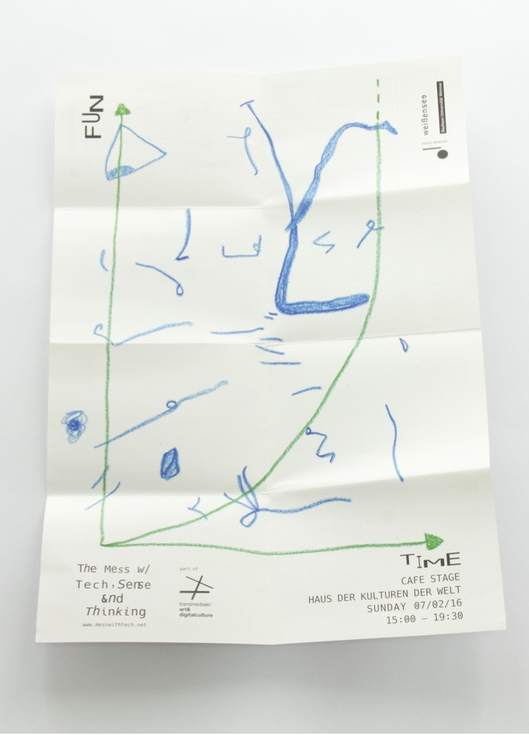
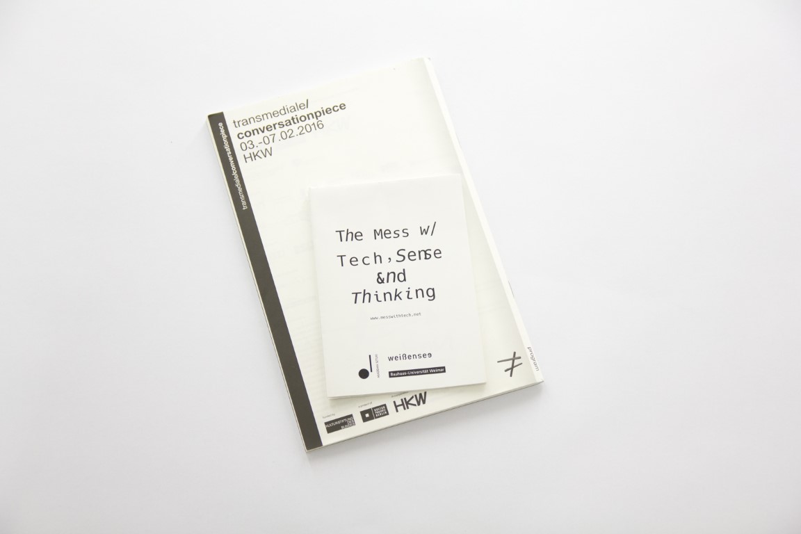
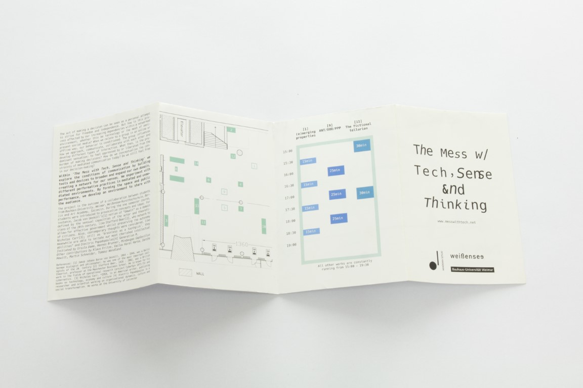
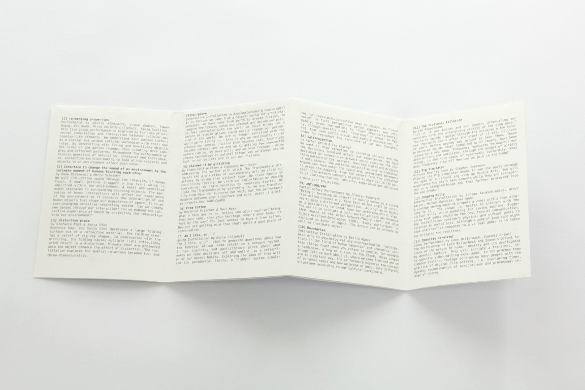
Mess with tech, sense & thinking
02 2016
Together with Rama Bielewski we designed a foldable Poster/Flyer combination for a hybrid event at transmediale16
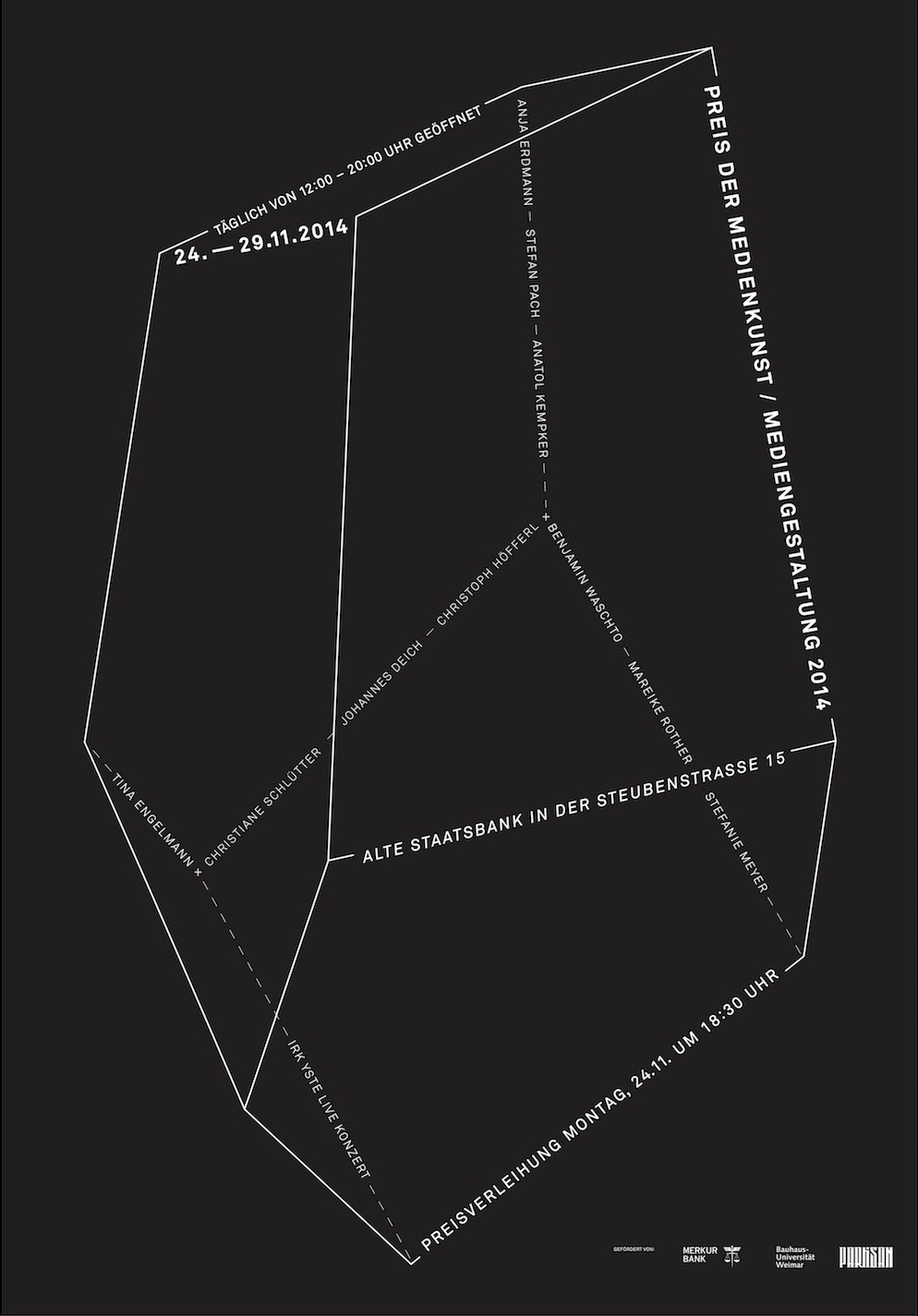
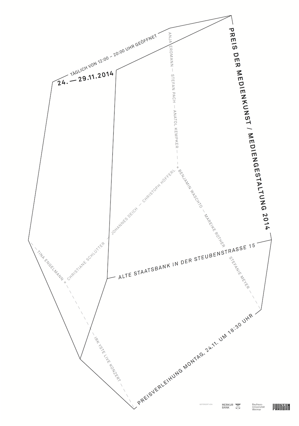
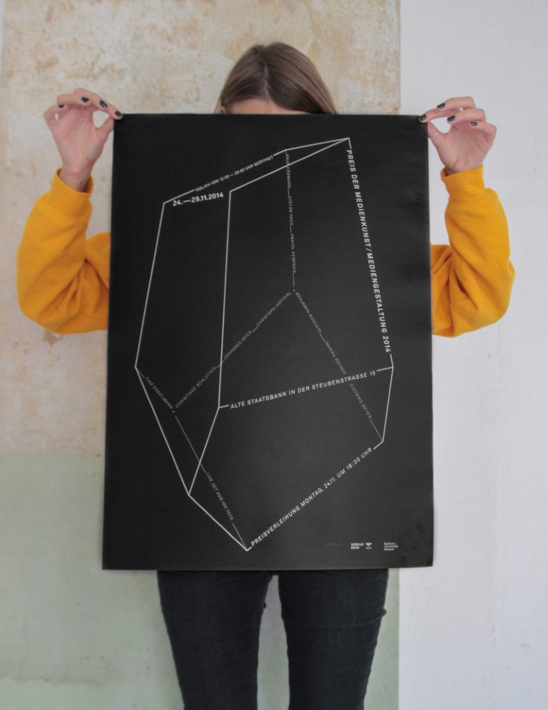
Preis der Medienkunst / Mediengestaltung
02 2016
The Media Art Award is an annual competition for recent graduates. With the help of Gunnar Green I created the minimalistic poster for the 2014 edition. The octahedron resembles a digital version of a handax, the first human tool. But it also stands for the 8 fields of study in Media Art and Design. A 3 dimensional version was given out as the first price.